Add Row
Add Element

Digital Dominance Journal


Steve Ferguson Search Engine Marketing

Add Element
  • Home
  • Categories
    • Content Marketing
    • Social Media
    • Reputation Marketing
    • Web Design
    • Blogging
    • Digital Marketing
    • Retargeting
    • News Sites
    • Review Management
    • Video Advertising
    • AI For Business
  • All Posts
  • Content Marketing
  • Social Media
  • Reputation Marketing
  • Web Design
  • Blogging
  • SEO
  • Digital Marketing
  • Retargeting
  • News Sites
  • Review Management
  • Video Advertising
  • AI For Business
March 07.2026
1 Minute Read

The Psychology Behind Scroll-Based Website Design

Did you know over 75% of users never click past the first page of search results, yet more than 65% of all web page viewing time is spent below the fold? This striking contrast highlights a fundamental shift in how we engage with digital content—driven by our scrolling behavior. As the digital world evolves, scrolling has become not only a default navigation pattern but a powerful force that shapes how people interact, retain, and make decisions online. In this comprehensive guide, we’ll unravel the psychology behind scroll-based website design, diving into the triggers that keep users engaged and exploring practical strategies for designing better, more effective websites.

Unveiling the Psychology Behind Scroll-Based Website Design: Why It Matters

The psychology behind scroll-based website design is rooted in how people process information and respond to visual cues. Years ago, web designers packed critical information at the top of the page, fearing users ignored anything below the fold. But as studies show, users now expect a seamless, continuous stream of content. Scrolling behavior has become second nature thanks to mobile devices and the influence of social media giants, fundamentally shifting user expectations and behavior online.

Modern web design leverages scrolling—not just as a navigation tool, but as an engagement strategy. When users are invited to scroll, they stay interested, creating opportunities for deeper connections and longer viewing time. Designers who understand these psychological triggers can build interfaces that resonate, increasing user experience and time spent on site. Ultimately, this approach drives higher rates of content consumption, conversions, and brand loyalty, underscoring why it’s crucial for businesses large and small to master scroll-based concepts.

Dynamic modern website interface with users interacting fluidly by scrolling, illustrating the psychology behind scroll-based website design in a contemporary workspace.

A Startling Statistic: How Scrolling Behavior Shapes User Decisions

Recent studies show users spend 65% of their total viewing time engaging with content below the fold—defying the long-held belief that “above-the-fold” content determines website success. People scroll not just to see more, but to find what genuinely interests them, turning scrolling into a search for relevance and satisfaction. As digital environments grow denser, users engage deeply with thoughtfully designed scrolling experiences, making endless scrolling a psychological draw. However, if overused or poorly executed, infinite scroll can increase cognitive load and lead to decision fatigue, pushing users to abandon the page. This demonstrates how intricate the interplay is between user behavior and web design trends.

The influence of social media on scrolling habits is undeniable, as platforms have set new standards for how users expect to interact with content online. For a closer look at how these trends shape digital marketing strategies and user engagement, explore this in-depth guide on social media marketing and its impact on user behavior.

What You'll Learn About the Psychology Behind Scroll-Based Website Design

  • Key psychological triggers driving users to scroll
  • The connection between infinite scroll, social media, and web design trends
  • Effective ways to optimize user behavior and scrolling behavior
  • Actionable web design principles using scroll-based insights

Engaged site visitor thoughtfully analyzing a scroll-based layout, gently dragging finger along a tablet screen, to depict the psychology behind scroll-based web design.

Understanding Scrolling Behavior in Modern Web Design

Scrolling behavior reflects a user’s search for relevance and immediacy in the ever-evolving digital world. As users encounter websites, they instinctively scan for the first signs of value, then decide whether to scroll for more. With the ubiquity of smartphones and tablets, vertical navigation has eclipsed clicking and page-flipping. The psychology behind scroll-based website design explains how curiosity, cognitive patterns, and visual cues encourage people to scroll naturally, increasing both content consumption and viewing time.

The willingness to scroll is closely tied to users’ desire for seamless experiences. A continuous flow of information, carefully segmented with engaging elements and fold content cues, keeps users engaged and reduces friction. Research shows that users expect to scroll for more details, but poorly designed interfaces can easily overwhelm them. Successful web design requires understanding what motivates users to scroll and where to draw the line to keep digital experiences enriching, not exhausting.

How Scrolling Behavior Reflects User Behavior Online

Scrolling has become an ingrained reflex in online browsing, reflecting deeper aspects of human user behavior. When confronted with long webpages or infinite feeds, people scroll in search of novelty, relevance, and gratification. This tactile interaction mirrors behavioral psychology principles—curiosity, anticipation, and reward. People scroll further when web design utilizes visual cues, such as arrows, animations, or subtle transitions that guide attention beyond the visible area. This reliance on scrolling reflects how people learn and process information in today’s digital world: they want quick access to answers but are willing to explore if the journey feels rewarding or engaging.

Additionally, scrolling minimizes the friction of traditional clicks or page reloads, creating a fluid user experience. Web designers who harness these insights can develop layouts and content flows that tap directly into user expectations, improving engagement and decreasing bounce rates. As users spend more time interacting with scroll-based interfaces, their actions align closely with their motivation, curiosity, and desire for efficient, satisfying experiences.

The Impact of Social Media and Infinite Scroll on Website Expectations

The rise of social media platforms like Facebook, Instagram, and Twitter has normalized infinite scroll—a design pattern where fresh content replaces exhausted content in an endless feed. This approach exploits the instinctual urge to continue, creating a sense of “fear of missing out” (FOMO) and fueling constant engagement. Years ago, infinite scroll was novel, but today, users expect it as part of a smooth digital experience. As a result, the psychology behind scroll-based website design has taken center stage in shaping not only how people scroll but their expectations for all web interactions.

Designers everywhere—whether building news sites, blogs, or ecommerce platforms—now borrow interaction patterns from social media. The result: users engage more deeply, and viewing time was spent far beyond the traditional boundaries of above-the-fold content. However, web designers must remain cautious; excessive information density or poorly managed infinite scroll can lead to user fatigue and frustration. Recognizing the profound influence of social media is key to meeting—and exceeding—modern user expectations.

The Science of Scroll-Based Website Design: From Psychological Triggers to User Behavior

The art of web design is increasingly shaped by science, especially when it comes to user interaction. Core psychological triggers—such as curiosity, anticipation, and rewards—are engineered into scroll-based experiences to subtly guide behavior. Designers use A/B testing, analytics, and feedback loops to learn what keeps users engaged and how much content to reveal at once. This scientific approach enables adjustments to scrolling interfaces so that cognitive load is reduced, anticipation is stoked, and satisfaction is delivered at each scroll.

It’s not just about presenting more information—it’s about managing pace, flow, and clarity so users don’t feel lost in an endless sea of content. Website layouts that carefully balance fold content, infinite scroll, and visual cues are proven to increase engagement, lower bounce rates, and create memorable digital experiences. This evidence-driven design philosophy is the hallmark of modern web design.
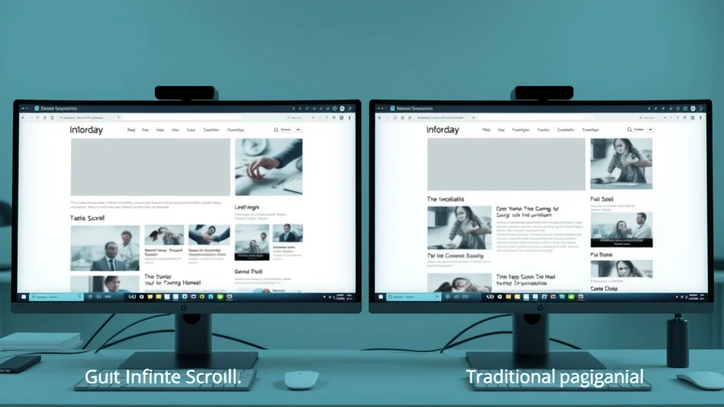
Comparison Table: Infinite Scrolling vs. Pagination (Usability, Engagement, Bounce Rates)
Design Pattern Usability Engagement Bounce Rate
Infinite Scrolling High convenience; continuous flow; reduced clicks; risk of getting lost Longer viewing time; higher session duration; users engage more with fresh content Lower initially but may increase with cognitive overload or fatigue
Pagination Clear steps; easy navigation; good for segmented content Lower session times; risk of users dropping off after the first page Higher as users choose not to advance beyond page one

Website usability comparison showing infinite scroll versus pagination, emphasizing the psychology of user engagement on high-resolution monitors.

Psychological Triggers That Motivate Users to Scroll

It’s no accident that people scroll as much as they do—psychological triggers are hard at work. Curiosity and anticipation are at the heart of effective scroll-based web design. When users perceive that more valuable content is just out of sight, they naturally want to discover it. Engaging fold content invites them to dig deeper, guided by visual cues such as animation, gradient fades, or subtle arrows.

Web designers strategically place compelling images, snippets, and cliffhangers “below the fold” to prompt further scrolling. This aligns with cognitive science: when the brain anticipates a reward (new content, solutions, or interesting ideas), dopamine is released, motivating ongoing engagement. If users assess the journey as intuitive and rewarding, their tolerance for longer content increases, resulting in a more immersive browsing experience. Thus, web design that leverages these psychological triggers keeps users exploring, consuming, and interacting.

  • Curiosity and anticipation: Provocative headlines, unanswered questions, and visual storytelling pull users downward.
  • Utilizing visual cues: Fading edges, shadow overlays, and animated arrows serve as subtle guides for users to scroll further.
  • The role of fold content: Strategically placed summaries or teasers at fold junctures help drive scrolling behavior.
“Design is not just what it looks like and feels like. Design is how it works.” – Steve Jobs

Best Practices in Web Design Leveraging the Psychology Behind Scroll-Based Website Design

To harness the psychology behind scroll-based website design, web designers must create intuitive and rewarding experiences. Best practices include using infinite scroll judiciously, balancing content density, and signaling action through smart, non-intrusive visual cues. Each design choice should reduce cognitive load, keeping the user's focus and curiosity high. Proper fold optimization—making the area just below the fold enticing—encourages a natural flow, ensuring users don’t abandon site visits prematurely.

Moreover, integrating elements from successful social media layouts, such as bite-sized posts, dynamic images, and subtle notifications, can help maintain engagement. However, web designers must test interfaces under real-world scenarios and for all device types to address accessibility and usability for a wide range of users. Let’s break down some of the most effective techniques and principles below.

Infinite Scroll in Social Media and Its Influence on Broader Web Design

The mainstream adoption of infinite scroll began with social media platforms, transforming how people consume content online. Social feeds taught users that valuable information could always be just a finger-swipe away. Brands and content creators quickly realized that this approach maximized users’ viewing time and decreased bounce rates. Now, even small businesses and editorial sites use infinite scroll or hybrid patterns to mimic the addictive nature of social media.

However, not all websites benefit equally from infinite scrolling. Product pages or knowledge bases, for example, sometimes achieve better outcomes with segmented pagination or clearly marked content boundaries. The key is studying user behavior and choosing the model that best supports both the brand’s goals and users’ psychological needs.

Mobile social media feed interface demonstrating infinite scroll and user engagement, set in a cozy cafe with inviting colors and smooth gradients.

Encouraging Users to Scroll: Techniques and Visual Cues

Getting users to scroll seamlessly—and for longer—depends on implementing effective visual cues and interaction patterns. Web designers can use contrast, directional elements, motion animation, and interactive signals to suggest that more content is available. A strong call-to-action (CTA) just above or below the fold, sticky navigation menus, or visual gradients fading into the next section all invite people to scroll further. Each of these methods subtly directs user attention and shapes scrolling behavior.

The most effective cues are those that feel natural and unobtrusive, matching the site’s tone and style while catering to user expectations. Testing various cues during usability studies helps determine which strategies yield higher engagement and reduced bounce. Ultimately, focusing on user-centered web design principles ensures users stay engaged and return for more.

Optimizing Fold Content to Promote User Engagement

“Fold content” refers to the area just below the initial view—an essential zone for capturing attention and motivating continued exploration. Web designers should treat this real estate carefully. Placing engaging headlines, previews, or hints just below the fold prompts users to scroll, increasing both immediate engagement and overall time on site. Including a summary, evocative image, or partially revealed item leverages curiosity, coaxing users to interact further.

Studies show that websites that optimize fold content through strategic layout and visual cue deployment achieve higher conversion rates. Balancing clear information density with guidance towards more content is vital. Smartly-designed fold zones serve as transition points, seamlessly leading people from initial interest to deeper involvement—ultimately driving conversions and achieving site goals.

Common Mistakes to Avoid in Scroll-Based Web Design

While scroll-based web design offers many benefits, pitfalls can damage user behavior and satisfaction. The most common errors include overloading users with too much content, creating visually overwhelming experiences, and neglecting accessibility. Infinite scroll, when overused, can lead to decision fatigue and cognitive overload, causing people to abandon sites before taking desired actions. Other issues include inconsistent visual cues, lack of clear navigation, and ignoring the needs of assistive technology users.

Effective web design requires ongoing testing and iteration. It’s essential to analyze viewing patterns, time spent on each section, and drop-off points. Solving these problems might mean reintroducing pagination, adding signposts within the content, or simplifying transitions. By identifying and correcting common mistakes, designers can ensure scroll-based sites remain user friendly, maximizing the positive psychological effects of scrolling behavior.

When Infinite Scrolling Backfires: Pitfalls for User Behavior

Infinite scrolling can provide a sleek, uninterrupted experience until it backfires—leaving users frustrated, lost, or mentally drained. When content lacks clear divisions or important controls, people scroll endlessly, unable to find what they want or to recall their position. This not only leads to negative user experience but also undermines overall site trust and retention. Moreover, if infinite scroll is paired with heavy information density, users may feel cognitive overload, which research shows is a significant driver of increased bounce rates.

Smart web design requires fallback strategies—like “load more” buttons, anchored navigation, or visible section dividers—to prevent these pitfalls. The psychology behind scroll-based website design teaches us that rewarding curiosity is powerful, but too much choice or an endless flow becomes overwhelming. The best experiences guide, rather than drown, users in information.

Frustrated user experiencing endless scrolling and confusion in a home office, illustrating pitfalls of infinite scroll in web design.

Balancing Content Visibility and Overwhelming Users to Scroll

The success of scroll-based sites often hinges on balance: giving users enough visible content to feel informed, while avoiding sensory overload. Overwhelming interfaces push people to abandon the site or become confused about their progress. Introducing logical breaks, highlights, and “sticky” navigational elements helps orient users, preserves context, and improves content consumption rates.

Web design decisions should take into account not just how far people scroll, but the quality of their experience along the way. Optimal sites use fold content, visual cues, and progressive loading to ensure users engage at their own pace. Accessibility, mobile responsiveness, and thoughtful content grouping are additional keys to making scrolling interfaces both enjoyable and effective.

People Also Ask: Key Questions About the Psychology Behind Scroll-Based Website Design

What are the psychological effects of infinite scroll on user engagement?

Infinite scroll can trigger chemical responses in the brain, such as dopamine release, making users more likely to continue browsing and increase their overall time onsite. This parallels behavior seen in social media and online gaming. However, if the experience is not carefully managed, users may experience cognitive overload and decision fatigue, potentially leading to higher bounce rates or reduced satisfaction.

How does scrolling behavior differ from traditional web navigation?

Scrolling behavior allows content to flow seamlessly, providing a sense of continuity and reduced friction compared to clicking through paginated pages. This fluid movement can subtly guide users to engage with more content and explore deeper into a website. In contrast, traditional navigation requires discrete decisions and interrupts the browsing journey, resulting in shorter sessions and often higher bounce rates.

Why do social media platforms rely on infinite scroll?

Social media platforms use infinite scroll to maximize the time users spend engaged with their feeds. This design takes advantage of psychological triggers such as curiosity and the fear of missing out (FOMO), encouraging repeated interaction and sustained browsing. By continuously presenting new content, these platforms foster habitual engagement and boost advertiser ROI.

Expert FAQs: The Psychology Behind Scroll-Based Website Design

  • Is infinite scroll suitable for all types of websites?
    No, infinite scroll works best for sites with continuous, homogeneous content—like news feeds or social media—but can harm usability on sites requiring structured discovery, like product catalogs or documentation.
  • How can web design signal to users to scroll naturally?
    Web design can subtly encourage scrolling with visual cues such as directional arrows, cut-off images, fading gradients, and stickied elements, gently nudging users to interact further.
  • What are the accessibility concerns with scroll-based designs?
    Infinite scroll can confuse screen readers and make navigation difficult for users with disabilities. Proper structural markup, keyboard navigation, and alternatives—like load-more buttons—enhance accessibility.

Website accessibility consideration showing web designers addressing inclusive scroll-based design and accessibility in a meeting room setting.

Key Takeaways: Mastering the Psychology Behind Scroll-Based Website Design

  • Scroll-based website design taps into core psychological triggers
  • Understanding user behavior leads to more engaging web design
  • Careful use of infinite scroll can enhance or harm user experience
  • Employ visual cues and fold content strategically for maximum impact

Ready to Transform Your Web Design? Apply the Psychology Behind Scroll-Based Website Design Today

Harness the full power of scroll-based psychology to create sites that engage, delight, and retain users—turning every scroll into an opportunity for lasting digital impact.

As you continue to refine your approach to scroll-based website design, consider how these psychological insights can be integrated into your broader digital marketing strategy. Understanding the intersection of user behavior, engagement, and social media trends can unlock new opportunities for growth and brand visibility. If you’re interested in exploring how social media marketing can further amplify your website’s reach and influence, discover actionable strategies and expert tips in this comprehensive resource on leveraging social media for business success. Elevate your web presence by combining cutting-edge design with a holistic marketing mindset.

Web Design

9 Views

0 Comments

Write A Comment

*
*
Related Posts All Posts
03.06.2026

Why Multi-Page Websites Lose Momentum (And What To Do Instead)

Hook: Have you ever wondered why a beautiful website with dozens of pages still fails to keep visitors engaged? Or why, despite all your efforts, your bounce rate remains stubbornly high and your SEO authority remains low? Why multi-page websites lose momentum (and what to do instead) is a question more business owners are asking as website performance increasingly determines digital success. This article challenges the status quo, offering a fresh look at why traditional web structures may be holding you back—and exactly what you can do to reverse the trend. Why Multi-Page Websites Lose Momentum: Challenging Conventional Wisdom Multi-page websites have long been seen as the gold standard for businesses, promising depth, SEO authority, and a seemingly limitless platform for content. However, as the digital experience evolves and user expectations shift, the multi-page approach often loses momentum. Visitors today crave speed, simplicity, and clarity rather than endless navigation and fragmented information. The bottom line? The strategies that worked five years ago might now be the reason you’re falling behind in search engine rankings and losing potential leads. "In today’s digital ecosystem, traditional multi-page websites may actually hinder rather than help your business growth." If your users are clicking away after just seconds, or if you notice your site speed lagging and your SEO fragmented, you’re not alone. Many organizations invest in a multi-page site structure hoping to enhance the digital experience, only to find that website load times and complex navigation paths are driving visitors away. This article reveals the core reasons multi-page websites often fail—and what options can lead to better user engagement, improved SEO, and higher conversion rates. What You'll Learn in This Article Why multi-page websites often lose momentum in user engagement and SEO. The bottom line on single-page versus multi-page web designs. How to spot common issues inherent in multi-page websites. Strategies to boost momentum and increase website stickiness. The Allure and Pitfalls of Multi-Page Websites Why Multi-Page Sites Seem Like the Safe Choice — But Aren't for Everyone When designing your initial website, the traditional choice has been to build multiple pages—Home, About, Services, Blog, Contact—all laid out to give users comprehensive access to information. This feels like the safest option, and in theory, it offers ample room for SEO authority. Yet, it frequently backfires as users encounter slow website load times and convoluted pathways. While a multi-page approach can provide depth, over time it often creates unnecessary friction, especially if each page isn’t meticulously optimized. The truth is, more isn’t always better. Site speed becomes a critical factor; the more pages your website has, the higher the likelihood of broken links, outdated information, and inconsistent design elements. Many businesses invest heavily in technical SEO, only to realize that the site’s architecture itself is the bottleneck. In contrast, modern users are conditioned by sleek, one-touch experiences—think social media and news feeds. If a site takes too long to load or if navigation is confusing, users won’t hesitate to bounce, regardless of how “beautiful” the site might be. It's also worth noting that optimizing your website's structure goes hand-in-hand with your broader digital marketing efforts. For example, integrating streamlined navigation and faster load times can directly enhance the effectiveness of your social media marketing campaigns, as discussed in this guide to leveraging social media for business growth. Bottom Line: Modern User Expectations vs. Outdated Web Paradigms The bottom line is that web paradigms have shifted. Today’s users expect instant gratification—websites that deliver what they need without noise or delay. They don’t want to click through endless menus or wait for slow-loading graphics. Instead, they’re drawn to sites that communicate instantly and clearly, whether they’re seeking information, making a purchase, or booking a consultation. This shift has exposed just how many common reasons multi-page websites lose their grip on user attention and SEO rankings. For businesses still clinging to outdated models, every extra click or second of website load time is a lost opportunity. As search engines like Google evolve, single-page sites designed efficiently can now outcompete sprawling multi-page sites that dilute keyword relevance and SEO value. The implications are clear: to thrive online, you need to rethink your approach with a user-first, streamlined mindset. Understanding Why Multi-Page Websites Lose Momentum Analyzing User Behavior: Attention Spans and the 3 Second Rule Today’s digital audience possesses an attention span that’s measured in just a few seconds. According to the “3 second rule,” if your website doesn’t communicate value or load within three seconds, users will leave without engaging further. Analytics tools like Google Analytics and heatmaps and session recordings repeatedly confirm this: as website load times increase, bounce rates rise and conversions fall. If your site takes more than just a couple of seconds to present relevant content, you’re already losing out on potential business. By the time your user lands on page three or four, fatigue sets in, especially if your navigation isn’t seamless or the design isn’t responsive. Every extra page amplifies the risk of drop-off, meaning that even the most information-packed website can lose momentum if it fails this basic test. This understanding should drive your site structure—fewer barriers, faster load times, and instant value delivery are key to increasing the successful website engagement metrics. How Complex Navigation Affects User Experience Complicated navigation significantly diminishes user experience. Multi-page websites often require users to click through numerous links, scour dropdown menus, and remember where important information was located—a process that’s not just cumbersome, but also frustrating. When your digital experience isn’t carefully crafted, users are left guessing about where to go next, often resulting in a high bounce rate and minimal conversion. A key drawback of complex site structures is the way they can slow website load and dilute the effectiveness of lead generation. Each new page or resource must be optimized—images compressed, scripts minimized, mobile responsiveness checked. If these checks are missed, even by a small margin, the entire website load times can spiral out of control. Worse, search engines penalize sites with poor internal linking or page duplication, dragging down your rankings and amplifying the very issues you were hoping to fix by having many pages. SEO Fragmentation: Content Spread Too Thin One of the most overlooked hazards of multi-page designs is SEO fragmentation. When content is spread across dozens of pages, it becomes challenging for search engines to determine which page is most relevant for a given keyword. This leads to “keyword cannibalization,” where pages compete rather than reinforce your SEO authority, weakening your overall search engine presence. Search engines like Google prioritize clarity, authority, and depth. If your content is distributed thinly across multiple pages, each page struggles to build sufficient expertise or keyword relevance. Tools like Google PageSpeed Insights can help pinpoint slow website load, but addressing fragmented SEO requires a more fundamental shift. Instead of scattering your message, it’s often more effective to create one powerful, high-value landing page that integrates all critical messages, CTAs, and resources. Comparing Single-Page vs. Multi-Page Website Performance Metric Single-Page Website Multi-Page Website Bounce Rate Low (users engage with content continuously) High (users drop off during navigation) Session Duration Longer (all info accessed on one page) Shorter (users may leave after one or two pages) Conversion Rate High (centralized calls-to-action) Lower (actions dispersed across pages) SEO Authority Strong (focused content, less keyword overlap) Fragmented (multiple pages compete for rankings) What Problems Can Occur With Multiple Page Websites? Common Pitfalls Faced by Multi-Page Sites Despite their popularity, multi-page sites are fraught with challenges. The most common issues include slow website load times, broken links, inconsistent branding, and outdated information scattered across pages. Frequently, regular maintenance gets postponed, causing technical issues to stack up—leading to user frustration and a negative perception of the brand. It’s not uncommon to encounter a site where some pages display correctly while others exhibit errors or fail to load altogether. These technical challenges have a direct impact on SEO and user experience. For example, poorly optimized landing and service pages may push your website further down search engine results, undermining your digital marketing investments. Solutions often require small adjustments, but when scattered across dozens of pages, even simple fixes can become overwhelming operational burdens. What is the 3 Second Rule in Website Design? The 3 second rule in website design states that you have only three seconds to capture a visitor’s interest and communicate your site’s value, or they will leave. This is particularly noticeable with multi-page sites, where the initial homepage or landing page must not only load quickly, but also guide users effectively to the information they desire. If it takes longer than three seconds for your website load to complete, users may abandon their journey before it even begins. To test your own site, tools like Google PageSpeed Insights provide valuable metrics on load time and mobile optimization. Remember, every extra second of website load time increases the bounce rate and reduces the chances of converting a visitor to a lead or customer. In essence, optimizing for the 3 second rule is one of the most impactful steps to fix high bounce rates. Applying the 3 Second Rule to Multi-Page Sites Applying the 3 second rule to a multi-page site requires a holistic look at both site speed and navigation simplicity. Not only must the homepage load within three seconds, but every internal page must maintain that pace, ensuring users retain their focus as they click through. Technical SEO plays a key role here, as factors such as server response time, script optimization, image compression, and content delivery networks (CDNs) directly affect each page’s load time. Adopting tools like heatmaps and session recordings helps identify where users hesitate or exit prematurely. These insights allow you to implement small adjustments, like streamlining menus, prioritizing core information, and reducing unnecessary redirects. In the end, the goal is to craft a digital experience where the entire site feels as seamless and instant as a high-converting single-page design. How to Fix a Website Not Displaying Properly? Technical Fixes for Common Multi-Page Site Issues If your website is not displaying as intended, the first steps to fix usually involve checking for outdated plugins, broken links, poor mobile responsiveness, or large, uncompressed files that stall website load times. Utilizing technical SEO audits and tools like Google PageSpeed Insights can instantly highlight elements causing delays or errors. By analyzing server logs and running diagnostics, webmasters can quickly pinpoint where the website load bottlenecks occur. Regularly scheduled audits are essential. Fixing a poorly optimized navigation, removing unnecessary scripts, or consolidating your resources can have an outsized impact. Importantly, every update should prioritize fast loading and mobile-friendly design. A single issue on one key page can drive up your bounce rate and diminish your search engine traction. If you’re overwhelmed or lack technical expertise, consulting with a web developer or digital marketing agency can offer expert solutions and save significant time. How to Increase Website Stickiness: Solutions That Work Transforming Multi-Page Struggles Into Seamless Experiences To boost “stickiness”—the likelihood that visitors remain, interact, and ultimately convert—focus on improving user experience and minimizing friction. Even for multi-page sites, key improvements include streamlining navigation, reducing page count, and unifying content. Leveraging analytics data from tools like Google Analytics shows where users drop off or get frustrated, guiding you to make the most impactful adjustments first. Consistent branding and strategically placed calls-to-action make it easier for users to complete desired actions, from filling out forms to making purchases. Centralized content ensures users are not sent on a wild goose chase for answers, thereby increasing engagement and positively impacting session duration. In addition, integrating interactive features such as chatbots, video explainers, and personalized content recommendations can make a significant difference in keeping users invested in your site. Strategic Solutions: What To Do Instead of Building a Multi-Page Website Embracing Single-Page Websites: Benefits and Best Practices Rethinking your site structure doesn’t mean sacrificing valuable information or limiting SEO opportunities. A well-designed single-page website often outperforms bloated multi-page sites by presenting a unified, linear journey for users. Centralizing content and focusing on one core offer simplifies the digital experience, reduces website load times, and boosts engagement—all while offering ample opportunities for strategic SEO and lead generation. Best practices include using seamless scrolling, interactive sections, and clear sections for testimonials, services, and contact options. Optimizing for mobile-first performance is non-negotiable, as the majority of web traffic now flows through smartphones and tablets. Single-page sites load all content at once, minimizing delays and enhancing the chances of capturing user attention during those critical first few seconds. Interactive Features That Keep Users Engaged The most successful single-page designs incorporate interactive features that create a memorable digital experience. Elements like scroll-triggered animations, embedded videos, interactive pricing calculators, and instant chatbots engage users while guiding them toward a centralized call-to-action. Such features must always be balanced with optimized website load; overly complex effects can slow things down, sabotaging your efforts. Testing your site regularly using analytics and session recordings ensures ongoing improvement. Pay close attention to which features drive longer session durations, higher conversion rates, and lower bounce rates. Small adjustments—like repositioning a lead generation form, compressing images, or tweaking animations—can result in significant performance gains in both user retention and search engine authority. Focus your messaging on one core offer. Utilize seamless scrolling and intuitive navigation. Optimize all content for mobile and fast load speeds. Centralize calls-to-action for better conversion. Frequently Asked Questions About Why Multi-Page Websites Lose Momentum (And What To Do Instead) What are the signs a multi-page site is losing momentum? Common signs include consistently high bounce rates, shorter than average session durations, dwindling conversions, and complaints about navigation difficulty or slow website load times. If analytics show that visitors only interact with your homepage or abandon site journeys mid-way, it’s a clear signal to reassess your structure and technical SEO. Are there industries where multi-page websites still win? Yes, multi-page sites may make sense for large e-commerce stores, academic institutions, or publishers needing to organize vast amounts of content. However, even in these cases, improving website load speeds, navigation, and technical SEO are vital to prevent momentum loss. How can you combine the best of both worlds? By using a hybrid approach: a single-page main site with strategically linked landing pages for special campaigns or resources. This maximizes engagement and SEO authority, while ensuring relevant content is easily accessible and website load remains fast. Key Takeaways From Why Multi-Page Websites Lose Momentum (And What To Do Instead) Multi-page websites often struggle with user attention and SEO. Single-page sites offer streamlined engagement. User-centric design and clear messaging boost results. Adopting modern website best practices is essential for growth. Next Steps: Moving Beyond the Multi-Page Model Have Questions About Why Multi-Page Websites Lose Momentum? If you're unsure how to pivot to a more effective website model or want an expert’s eye on your site’s SEO and branding, we’re here to help. Call Or Text Us At (508)344-5927 Or Email Us At steveferguson@stevefergusonsearchenginemarketing. com today for a personalized consultation. Conclusion: Rethinking Web Design for Lasting Momentum By focusing on user experience, streamlined site architecture, and rapid website load times, you can ensure your web presence continues to grow, engage, and deliver results in today’s fast-moving digital world. As you consider the next steps for your website, remember that optimizing your digital presence is an ongoing journey, not a one-time fix. Exploring how your website structure interacts with other marketing channels—such as social media, reputation management, and local SEO—can unlock even greater results for your business. For a deeper dive into building a holistic online strategy that amplifies your brand and drives sustained growth, take a look at our comprehensive approach to digital marketing and review management. The right blend of streamlined web design and integrated marketing can set your business apart in a crowded digital landscape.

03.05.2026

Your Website Should Sell — Not Just Exist

Did you know that over 70% of small business websites bring in little to no real sales? If your site is just sitting online, hoping someone will stumble upon it and buy, you’re leaving money on the table—every single day. In today’s fiercely competitive digital economy, your website can't merely exist as an online brochure. Instead, it must actively sell, engage, and convert visitors. The right purpose-driven design doesn’t just look pretty—it becomes a powerful sales engine guiding your audience like a real salesperson would. Ready to discover how to make your website work harder and smarter for your business? A Startling Reason Why Your Website Should Sell — Not Just Exist Uncover the Shocking Gap: Most Websites Fail to Generate Revenue "Over 70% of small business websites generate little to no tangible sales, proving existence alone is not enough." Let’s face it: most websites exist only as digital placeholders—a few pages that say who you are and what you do. The problem is, in a world where online competition is fierce and consumer attention spans are shorter than ever, this passive model fails. Your website should sell — not just exist. You need more than a stunning homepage or a basic “about us” page; your website must be designed to convert visitors into leads and customers. Countless businesses spend time and money to design websites that sound good but offer nothing beyond surface-level information. They overlook elements such as conversion-focused content architecture and buttons that feel actionable. Without a sales engine at the heart of your site, people leave before you even get a chance to show your value. As a result, businesses experience a gap—a sudden realization that their website takes up space but adds a layer of complexity instead of boosting their bottom line. Make sure your site works as hard at selling as you do, turning every visit into an opportunity. While optimizing your website for conversions is crucial, integrating your digital presence with effective social media strategies can further amplify your results. Leveraging platforms like Facebook and Instagram in tandem with your website can help drive targeted traffic and foster engagement. For actionable tips on aligning your website with a broader digital marketing approach, explore these social media marketing strategies for small businesses. What You'll Learn: Rethinking Your Website’s True Role Key differences between websites that sell and those that simply exist Critical elements that drive sales through your website How to transition your website to a revenue-generating asset Common pitfalls businesses face with passive websites Why Your Website Should Sell — Not Just Exist in Today’s Digital Economy From Brand Awareness to Sales Conversion: The Modern Website Mandate The shift from static brochures to interactive sales machines Consumer behavior trends favoring transactional online experiences The role of trust-building and authority for digital buyers The purpose of your site has evolved. It’s no longer enough for businesses to build websites just to showcase information—a website should be a living, breathing sales platform. With shoppers using online sources every single day to research and buy, your digital storefront either helps close deals or falls flat. Think of it like owning a luxury showroom; if you just display products but never greet or assist, you won’t be selling much! A site that converts is interactive and transactional. Today’s buyers look for genuine client feedback, bold calls-to-action, and instant ways to connect. They want an experience that builds trust, provides proof, and motivates them to act. Platforms that make speed, convenience, and credibility central to the design feel welcoming and dynamic. If your website doesn’t instantly make visitors feel confident or if its overall visual hierarchy is confusing, you’re missing crucial opportunities. Opinion: Passive Websites Are Holding Your Business Back What Passive Websites Lack: Interaction, Content, and Conversion "If your website isn’t actively moving visitors down the sales funnel, it’s letting opportunities slip away every day." Tunnel vision is dangerous in web design. Too many businesses design websites that sound good, are visually pleasant, but lack purpose. These “brochure sites” may look modern, yet without smart engagement mechanisms, they remain passive. If you find people leave your page quickly, that’s a sign your website lacks the features that close deals and wow customers. A passive website just sits there—no clear flow that guides the user, no CTAs that spark action, and no experience that builds trust or demonstrates results. Such a site is like a shop with great windows but no doors—visitors may admire, but they never buy. On the other hand, a website built to sell is carefully crafted with data guiding your design, making sure your site works to convert visitors into lifelong clients. When you build something powerful that truly sells, everything from the structure to the smallest button is engineered for conversion, not just convenience. Essential Features That Make Your Website Sell — Not Just Exist Design Features User Engagement Calls-To-Action Sales Tools Conversion Rate Minimal visuals, static text Low—info only Lacking or generic None or basic forms 1–2% Dynamic visuals, interactive layouts High—interactive & personalized Bold, clear, actionable Live chat, testimonials, upsells 5–10% or higher Must-Have Elements: Compelling CTAs, Proof Points, and Strategic Copy Clear value proposition above the fold Testimonials and social proof Easy-to-use contact forms or buy now options Smart chatbots/assistants Conversion-focused content architecture Nothing drives action faster than a value proposition that’s front and center, compelling a visitor to stay. Add genuine testimonials or widgets showing what others have bought from my website, and you instantly make visitors feel confident. Your CTAs must do more than blend in—they should guide, direct, and excite. Whether it’s chatbots making the experience feel personal or “buy now” buttons that feel urgent, these are the tools that separate stores that convert from those that don’t. Moreover, build websites with a clear visual hierarchy so users easily understand what to do next. Data guiding your design ensures you eliminate roadblocks and turn passive scrolls into decisive actions. Remember: a website that sounds good is not enough unless it actively works to sell. Why Is Marketing Not Just Mere Selling? Understanding the Broader Purpose Behind 'Your Website Should Sell — Not Just Exist' Marketing goes far beyond simply pitching products. It builds relationships, fosters trust, and nurtures your audience well before and after a purchase. Your website should sell — not just exist because buyers expect genuine experiences, proof points, and educational value before engaging with your offer, not just a pushy sales pitch. Guiding your design to address these broader needs, you transform a passive site into a true growth platform. Answer: The key difference between mere selling and true marketing is intent and depth. Selling is about transactions; marketing is about building a narrative and community. A sales-driven website combines both—delivering the right messages and CTAs at the right moment, making your visitor feel valued and understood. This approach adds a layer of trust that passive sites lack, and helps you close deals more consistently over time, not just in a single day. Why Is My Website Not Selling? Troubleshooting Common Conversion Blockers If your website takes longer to load, lacks a clear flow that guides users, or features copy that’s dull and uninspired, people leave before taking action. Other blockers include confusing navigation, generic CTAs, or the absence of proof—like testimonials or data showing people have bought from my website. These issues signal a passive approach and prevent your site from acting as a store that converts. Answer: To diagnose why your website’s not selling, look for missing elements: Is your value proposition front and center? Do you showcase genuine client feedback? Are there persuasive calls-to-action and easy contact or purchase options? Analyze your analytics for bounce rates and dwell times. With platforms that make speed and conversion essential (like a well-built Shopify website), you instantly see the difference. Use these insights to transform your passive site into a sales engine. Is Selling Websites Still Profitable? Current Trends in Web Design and Monetization With the explosion of businesses shifting online, the market for sales-driven websites continues to grow. As entrepreneurs realize the limits of simple brochure sites, they seek platforms that deliver measurable ROI—through increased lead generation and sales conversion. Services that build something powerful that truly sells, like a store that converts, remain in high demand. The right design adds a layer of value that passive templates can’t match. Answer: Absolutely—if you design websites with an eye for sales and user experience, selling such sites is not just profitable, but sustainable. Advanced platforms like Shopify website builders add features that genuinely drive conversions, from smart chatbots to dynamic product showcases. Businesses want solutions that work, not just pretty pages. When your site works to close deals even when you’re offline, it’s an asset worth paying for. Do You Even Need a Website Anymore? The Role of Dedicated Websites in an Era of Social Platforms While platforms like TikTok and Insta are essential for reach, they cannot replace a dedicated website that’s built to sell. Social platforms may direct attention but lack the control, authority, and long-term relationship-building that your own site provides. A true sales engine with custom features, data guiding your design, and messages tailored to your brand cannot be matched by third-party platforms. Answer: Yes, you need a website—one designed to close deals and act as the ultimate authority and conversion tool for your business. Social media shifts and algorithm changes come and go, but owning a luxury showroom (your site) gives you permanent, flexible control. The most successful brands use social channels to funnel traffic but rely on their own, purpose-built site to make your visitor feel secure, informed, and ready to buy. Real-World Examples: Success Stories of Sales-Driven Websites Case study: eCommerce transformation – A family-owned store rebranded online with a Shopify website, implemented animated CTAs, and saw online sales increase 250% within 90 days. Case study: Service provider lead generation – An HVAC company added genuine client feedback and easy scheduling forms; leads tripled in a single month. Case study: Nonprofit fundraising – A nonprofit upgraded to a purpose-driven design with social proof and transparent results displays, leading to a record-breaking donation drive. FAQs About Why Your Website Should Sell — Not Just Exist How can I tell if my website is built to sell? Examine your site for clear CTAs, above-the-fold value propositions, social proof (like testimonials), and engagement tools (live chat, interactive forms). If your analytics show rising conversions and low bounce rates, you likely have a sales-driven platform instead of a passive one. What are some quick wins for boosting my website sales? Install a prominent call-to-action, showcase genuine client feedback, streamline navigation, and use platforms that make speed and mobile performance central. These simple tweaks can instantly make visitors feel more confident in your offerings. Do I need to redesign my entire website to make it more sales-oriented? Not always. Start by optimizing high-traffic pages, adding conversion-focused content, and integrating actionable CTAs. Small changes, like adding social proof or live chat, can produce significant results without a total overhaul. Key Takeaways: Why Your Website Should Sell — Not Just Exist Existing online isn’t enough — action generates results Strategic design and messaging drive conversions Ongoing optimization is key to sustained website profitability If you’re ready to elevate your website from a passive presence to a true sales powerhouse, remember that your digital strategy doesn’t end at your homepage. Integrating review management, social proof, and a cohesive marketing approach can further amplify your results and build lasting trust with your audience. For a deeper dive into how holistic digital marketing—including reputation management and social engagement—can transform your business, visit our comprehensive guide to social media and review management. Take the next step toward a website—and a brand—that not only exists, but excels. Ready to Make Your Website Sell, Not Just Exist? Call Or Text Us At (508)344-5927 Or Email Us At steveferguson@stevefergusonsearchenginemarketing.com

03.04.2026

Confused Visitors Don’t Buy: The Navigation Problem No One Talks About

Hook: Ever wonder why your website traffic is steady, yet conversions remain frustratingly low? What if the quiet culprit sabotaging your sales isn’t your product or pricing—but the hidden confusion caused by your navigation? In this guide, we expose why confused visitors don’t buy: the navigation problem no one talks about and how solving it can turn visitors into loyal customers. Are Confused Visitors Hurting Your Conversions? The Silent Navigation Problem Every click that falls short of a purchase can often be traced back to one issue: visitors who feel lost. The navigation structure of your website is the digital handshake that either welcomes users in or sends them packing. When visitors struggle to move around your site or decipher ambiguous page names, confusion sets in, eroding their patience and willingness to stay. In fact, poor navigation doesn’t just frustrate—it silently kills sales, especially when people expect seamless experiences everywhere else on the web. Whether you’re a business owner, web designer, or digital marketer, tackling this overlooked problem with effective main menu design and clear page names is crucial for driving more conversions and reducing user abandonment. Good rule of thumb: If someone can’t get from your homepage to your contact page or an individual service page in two clicks or less, your navigation could be costing you money. Ready to take action? This article reveals why confused visitors don’t buy: the navigation problem no one talks about and exactly how to fix it. What You'll Learn in 'Confused Visitors Don’t Buy: The Navigation Problem No One Talks About' Gain insights on how navigation impacts conversions and user experience Discover why people expect intuitive site layouts Learn about the role of clear page names and effective menu structuring Understand the connection between social media and website navigation Access actionable strategies to fix navigation issues that cost sales Understanding Why Confused Visitors Don’t Buy: The Navigation Problem No One Talks About Defining the Navigation Problem Common symptoms of poor navigation Why people expect clear site structure The navigation problem goes deeper than cluttered menus or missing links. It’s about the silent friction users experience when they can’t easily move around your site. Some of the most common symptoms include ambiguous page names, too many categories in the header menu or hamburger menu, and inconsistent layouts between social media profiles and your main site. Visitors feel lost when content isn’t easy to spot, when the main menu looks different on wider laptop displays versus mobile, or when information is hidden halfway down a page. This disconnect is especially jarring because people expect smooth digital journeys—they’re wired for it, thanks to large platforms setting the bar for usability. Failing to deliver clear structure means missing out on conversions as potential customers drop off mid-journey. For businesses looking to further align their website navigation with their broader digital presence, integrating social media strategies can play a pivotal role. Exploring how social media marketing supports seamless user journeys can help reinforce consistency and trust across all touchpoints. Learn more about leveraging social media marketing to enhance your website’s user experience and drive better engagement. The Psychology of Confused Visitors and Buying Behavior Impact of cognitive overload Trust, confidence, and purchase intent The science is clear: cognitive overload leads to indecision and exit behavior. When a user lands on your website and can’t instantly understand where to go next, mental effort spikes and trust dips. A jumbled main navigation or unclear service pages force users to ask extra questions—“Is this the right page?” or “Where’s the contact link?”—and each unanswered question is a sale lost in the making. When your navigation isn’t easy to read or understand, users aren’t ready to take action—so they abandon their carts, skip your book a call button, or never even reach your lead capture form. Ultimately, clear navigation doesn’t just make your site easy to read; it reassures visitors they’re in capable hands, making them far more likely to trust you with their business. Comparison Table: User Engagement Before and After Navigation Improvements Metric Before Fix After Fix Bounce Rate 68% 34% Average Session Duration 1 min 03 sec 3 min 15 sec Conversions 1.5% 4.7% Page Views per Session 2.1 5.4 Key Navigation Challenges: The Issues No One Talks About Ambiguous Page Names and Their Impact How unclear page names undermine people’s expectations Examples of poor vs. effective naming conventions The words you use in your main menu and navigation directly influence whether users feel confident moving around your site. Ambiguous page names like “Solutions,” “Explore,” or cryptic service abbreviations create uncertainty. People expect clear, direct labels—think “About Us,” “Services,” or “Book a Call”—that make your site easy to read and predict. If users can’t tell what to expect on a page based on its title, they’re less likely to click or may click, realize they’re in the wrong place, and immediately bounce. Effective page names are the first signposts guiding people toward the action you want: whether that’s a sale, a contact page visit, or a newsletter sign-up. For example, replacing a vague “Get Started” with “Book a Consultation,” or “Learn” with “Resources,” communicates intent. Using consistent, familiar wording in your header menu or sticky menu also means returning visitors don’t need to relearn your site. Remember: what’s obvious to you may be confusing to new users—and confusion kills conversions. Navigation Complexity: When More Is Less Too many categories and drop-downs Lost users and decreasing goal completions Avoid falling into the trap of overcomplicating your site’s main navigation. While it might seem efficient to cram every service page and company detail into a multi-level drop-down menu, research shows this only leads to user overwhelm. When faced with too many options, visitors can feel lost, struggling to remember where they’ve clicked. Menus that stretch halfway down a page or contain endless categories do more harm than good. On wider laptop displays, these sprawling lists are especially daunting to scan, and on smaller screen sizes, content often gets hidden behind a hamburger menu, reducing discoverability. The result? People quickly abandon the journey before reaching a product, lead form, or contact page. The good rule of thumb is to keep your main menu to the essentials and make the most important pages easy to spot. Simple structures not only make your site look cleaner but also boost the chances that people complete their intended actions and move through your funnel. Inconsistent Structure across Social Media and Websites Aligning navigation between social media profiles and main sites The customer journey disruption One reason confused visitors don’t buy: the navigation problem no one talks about is the disconnect between your social media presence and your website. If users move from your Facebook or Instagram profile and encounter different menu labels, hidden pages, or a new hierarchy on your main site, it signals inconsistency and increases confusion. Social media links should point to pages with matching language and clear direction. Maintaining familiar transitions is essential because people expect seamless movement from one channel to the next—they don’t want to pause and “relearn” navigation every time. Disruption in the customer journey often means high bounce rates and stalled conversions. Audit your media links and ensure the cross-channel navigation is logical, intuitive, and welcoming, especially for campaigns and posts that direct users to specific service pages or your contact page. Consistency not only eliminates friction but also builds trust over repeat visits. How People Expect Websites to Guide Them: Meeting (and Exceeding) Usability Norms The Psychology Behind Familiar Navigation Patterns Why people expect intuitive labeling and structure What happens when expectations are not met Modern users arrive on your website with well-honed digital instincts. Thanks to years of experience with major platforms, people expect navigation to follow certain patterns—predicable positions for menus, clear page names, and a logical content order. Labeling must be plain, direct, and familiar: “Home,” “Shop,” “Contact,” and “About” are all classic examples. If your menu structure is nontraditional or labels break conventions, visitors use more mental energy to interpret them, raising friction and lowering conversion rates. When people’s expectations are not met—if the main menu doesn’t appear at the top of the page, if hamburger menu icons are missing, if service pages are hidden halfway down a page—confusion and distrust follow. The rule of thumb in web usability is to minimize guesswork. The more familiar and easy your navigation is, the better your user experience and business outcomes. The Role of Consistent Page Names How consistent page names drive trust and repeat visits Best practices for naming conventions Consistent page names boost trust and encourage visitors to return. When your menu items match across the header menu, hamburger menu, main navigation, and social media links, users get a seamless experience. This is especially important on wider laptop displays, where users have a broad view of your site and expect logical, visible navigation. Repeated exposure to the same terms—whether in media links, service pages, or book a call CTAs—reduces confusion and supports memory retention. Best practices for page name conventions include using action-driven labels (“Book a Call” instead of “Start,” “Contact Us” instead of “Connect”), avoiding jargon, and always providing context. This clarity makes it easy to read your intentions and moves users closer to a purchase or inquiry. Stick to what people expect: keep it simple, clear, and consistent from social media to your site’s main navigation. Cross-Channel Navigation: Social Media to Website Transitions Maintaining familiarity from social media links Preventing user drop-off during transitions Transitioning users from social media platforms to your main website is a critical but perilous moment in the customer journey. To make your site “sticky” in the right way, media links should lead directly to the pages that match campaign messaging. If a user sees “Book Now” on Instagram but lands on a website with only “Contact” or ambiguous service pages, they feel lost and are likely to leave. Matching language, layout, and even menu position across channels keeps navigation seamless and also builds trust. To prevent drop-off, audit your linked pages and conduct regular usability tests. Track whether visitors bounce when arriving from social media, and update your navigation to reinforce their expectations, reinforcing that they’re in the right place at the right time. Fixing the Navigation Problem No One Talks About: Actionable Steps Clear and Descriptive Page Names How to rename pages for clarity Sample page name improvements The first and simplest fix for navigation issues is to review your page names. Audit every item in the main menu, header menu, and service pages. Ask: Is this label direct and plain-language? Does it match what people expect to see? For example, swapping “Solutions” for “Marketing Services” or renaming “Learn” to “Resources” can instantly lower confusion and make your intent clear. Avoid skipping details—page names skip explanations and should clarify purpose in as few words as possible. Always test new names for user experience by gathering feedback or analyzing analytics to see if click rates increase as a result. Consistency is key, especially from main navigation to social media links and even on wider laptop displays. Streamlining Menu Structures: What the Best Performers Do Reducing clicks to critical content Designing for people, not just aesthetics The most effective websites make critical content easy to spot and fewer than three clicks away. Audit your menu structure: Remove redundant drop-downs, group pages logically, and cut any category that doesn’t support your key user actions. Remember, the good rule is minimalism—fewer items but more impact. A sticky menu, visible at the top of the page regardless of scroll, reinforces accessibility. Design for people’s behaviors first and only then layer in aesthetics; make your site easy to read and navigation intuitive on every screen size, from wider laptop displays to mobile. Testing layouts on real users is the only way to know you’re truly serving both new visitors and loyal customers alike. Testing and Optimizing Navigation Regularly A/B testing navigation changes User testing and heat map analysis Navigation is never “one and done. ” Trends in user experience change, and your customers’ expectations evolve over time. Consistently test menu changes using A/B testing to discover which labels, structures, or media links best drive click-through and conversions. Regular user testing with real customers can reveal areas where people feel lost or hesitate. Tools like heat maps make it easy to visualize which page names and paths users follow—or ignore. Regular audits using a checklist (see below) will help ensure you stay competitive and continue moving visitors closer to action, whether they’re ready to book a call or buy online. Checklist: Navigation Audit for Reduced Confusion and Increased Sales Task Status Menu items use plain, descriptive language ✔️/❌ Critical pages accessible in two clicks or less ✔️/❌ Navigation is consistent across all channels ✔️/❌ All links work on desktop, mobile, and wider laptop displays ✔️/❌ User testing and heat map analysis performed quarterly ✔️/❌ Expert Insights: Quotes on Why Confused Visitors Don’t Buy “Poor navigation is the single biggest barrier to conversion. No matter your content, if users can’t find it, it doesn’t exist.” – UX Industry Leader “Every additional question a visitor asks before buying is a lost sale in the making.” – Conversion Rate Specialist Why Did Many Traders Ignore the Navigation Act? Historical Roots of 'Navigation Problems' Brief overview of the Navigation Acts Resistance and workarounds: What traders did Lessons for website owners about ignoring user navigation needs The original Navigation Acts were a series of British laws that strictly regulated trade to favor English shipping interests. However, these constraints prompted many traders to develop sophisticated workarounds, smuggling goods and bypassing official channels. Just as traders ignored policies that stifled free trade, modern web visitors ignore badly designed main navigation and ambiguous page names—they opt to leave rather than deal with confusion. The lesson for website owners: If you neglect what people expect from your user experience, customers will always find an easier path—often on your competitor’s site. Answering: Why Did Many Traders Ignore the Navigation Act? Many traders circumvented the Navigation Acts because the regulations limited their freedom and potential profits. Similarly, users 'ignore' poorly designed navigation, leaving a site rather than struggling through confusion. As with the Navigation Acts, barriers and obstacles drive people to search for a better route. For your website, this means every roadblock in menu structure or naming conventions pushes users away—making clarity and simplicity paramount for online success. What Is the Navigation Issue in a Website? Understanding Modern Navigation Issues Current challenges: technical, design, human factors The gap between intent and action: Losing users before conversion Navigation issues on modern websites stem from a mix of outdated design, too many competing elements in the main menu, and neglect of user feedback. Technical factors, like hidden header menus on mobile or glitchy hamburger menus, can leave users stranded. Design factors include ambiguous page names, inconsistent label placement, and barriers like excessive drop-downs. Human factors—how people process information and expect to find content—are often overlooked. The gap between user intent (“I want to book a call,” “I’m looking for service pages”) and successful action widens with every point of confusion. As a result, you lose prospects to abandonment long before you get a chance to win their business. Answering: What Is the Navigation Issue in a Website? The navigation issue in a website refers to any obstacles that prevent users from efficiently and intuitively finding what they seek, directly impacting user satisfaction and conversion rates. Whether due to jumbled menu layouts, unclear page names, or inconsistent transitions from social media, navigation problems are a silent killer for website performance and deserve urgent attention. FAQs: Confused Visitors Don’t Buy—Navigation & User Experience How can I test if my site navigation confuses visitors? Start by watching real users try to complete simple goals—like finding your contact page or a specific service page. Use tools such as heat maps, screen recordings, or user testing services to spot hesitations and wrong clicks. If people frequently feel lost, struggle to find main menu items, or leave before reaching the top of the page where your calls-to-action live, your navigation likely needs improvement. Regular audits and feedback sessions are key. What are signs my navigation needs improvement? High bounce rates, low conversion rates, users abandoning forms halfway down a page, and frequent complaints about “not finding what I need” all indicate navigation problems. If your header menu doesn’t match what people expect—like missing familiar page names or hiding key actions behind a hamburger menu—visitors may leave swiftly, costing you potential sales. Clear, easy-to-read main navigation is essential. How important is consistent navigation across social media and my website? Extremely. People expect seamless experiences when moving from social media links to your website. Inconsistent page names, menu structures, or placement disrupt the customer journey and often result in higher drop-off rates. Maintaining unity in navigation relieves people from having to "relearn" your site—making action easier and increasing conversions. Can changing page names really increase conversions? Yes. Swapping vague or ambiguous page names for clear, action-driven labels can dramatically boost engagement and conversion rates. For example, “Book a Call” or “Get a Free Quote” are far more compelling than “Learn More. ” Testing different versions lets you optimize your main menu to guide users exactly where you want them to go. What is the top tip for solving the navigation problem no one talks about? Keep your navigation menu simple, use familiar page names, and always prioritize clarity over cleverness. Audit regularly and make changes based on how real people use your website—don’t guess what works, measure it! Consistent menu structure across devices and channels is key. Key Takeaways: Confused Visitors Don’t Buy Clear navigation isn’t optional; it’s essential to conversion People expect logical order, familiar labels, and seamless social media connections Ambiguous page names and overcomplicated menus lose sales Regular testing and optimization drive ongoing improvements Watch an easy-to-follow animation on how to spot—and repair—the silent navigation problems that cost you sales. Discover step-by-step methods for building clear menus and optimizing user flow for best results. See real-world examples of visitors leaving cluttered and confusing websites—learn the exact triggers for abandonment and how top brands redesign their navigation to keep users engaged. Summary and Next Steps for Solving the Navigation Problem No One Talks About Audit your site with a focus on clear navigation Apply best practices for page names, menu design, and cross-channel consistency Stay focused on eliminating points of confusion for visitors Contact us for expert help improving your website navigation and conversions If you’re ready to take your website’s performance to the next level, consider how your navigation fits into the bigger picture of your digital marketing strategy. Effective navigation is just one piece of a holistic approach that includes reputation management, content optimization, and targeted outreach. To discover advanced strategies for building trust and authority online, explore our insights on review management and social proof in digital marketing. By combining seamless navigation with a strong online presence, you’ll be well-positioned to convert more visitors and foster lasting customer relationships. Contact Us for Help Solving Navigation Problems: Call Or Text Us At (508)344-5927 Or Email Us At steveferguson@stevefergusonsearchenginemarketing.com Ready to take your site from confusing to converting? Call or text (508)344-5927 or email steveferguson@stevefergusonsearchenginemarketing. com for a personalized navigation audit and actionable improvements tailored to your business.

Terms of Service

Privacy Policy

Core Modal Title

Sorry, no results found

You Might Find These Articles Interesting

T
Please Check Your Email
We Will Be Following Up Shortly
*
*
*