Add Row
Add Element

Digital Dominance Journal


Steve Ferguson Search Engine Marketing

Add Element
  • Home
  • Categories
    • Content Marketing
    • Social Media
    • Reputation Marketing
    • Web Design
    • Blogging
    • Digital Marketing
    • Retargeting
    • News Sites
    • Review Management
    • Video Advertising
    • AI For Business
  • All Posts
  • Content Marketing
  • Social Media
  • Reputation Marketing
  • Web Design
  • Blogging
  • SEO
  • Digital Marketing
  • Retargeting
  • News Sites
  • Review Management
  • Video Advertising
  • AI For Business
March 02.2026
1 Minute Read

Today's Audience Scrolls — They Don’t Click

Are you still chasing clicks, only to see engagement plateau while your audience scrolls right past your carefully crafted content? Discover why the rules of digital engagement have changed and how mastering scroll-worthy strategies is key to real growth in 2024.

Modern digital audience scrolling smartphones in a bright coworking space, deep focus on natural engagement — today

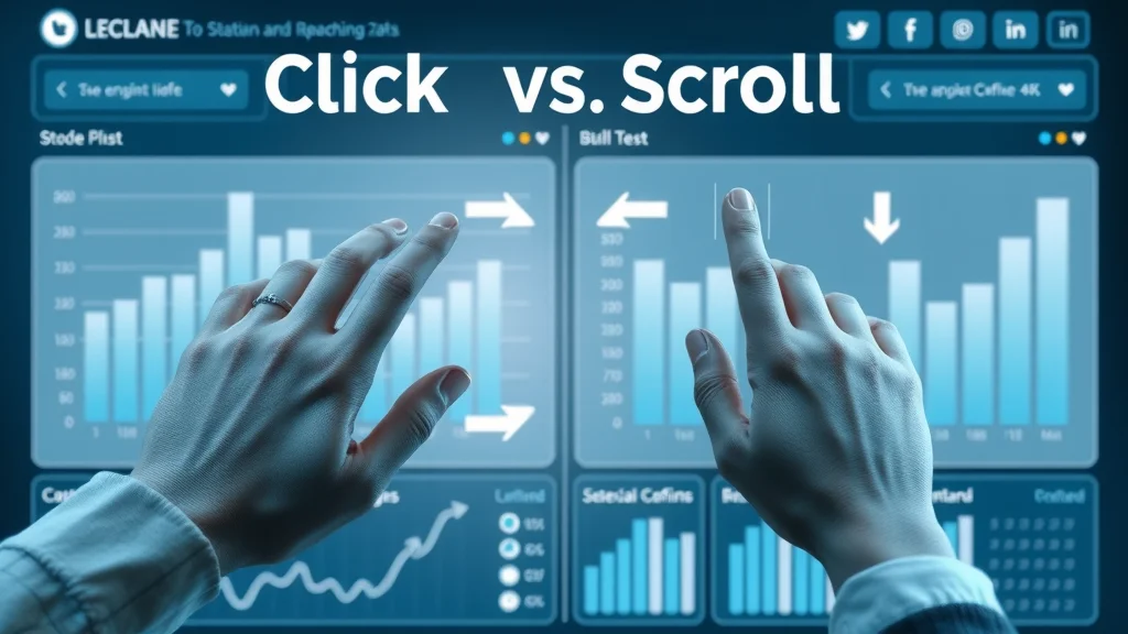
Are You Still Chasing Clicks? Why Today’s Audience Scrolls — They Don’t Click

In today’s digital world, click content is no longer the main driver of audience engagement or list growth. The popularity of social media platforms like Instagram and TikTok has fundamentally shifted how users interact with content. Rather than clicking through to websites or landing pages, today’s audience scrolls — they don’t click. This presents a critical challenge for marketers, creators, and brands that are stuck in old engagement models focused solely on click-through rates and direct response tactics.

The growth plateau many face is not just a temporary blip; it’s a direct result of outdated strategies. As users scroll through endless feeds, pausing only briefly on what truly captivates them, it’s essential to learn what makes people stop and engage. This means rethinking how you capture attention and drive list growth in a world where users process more content faster than ever before. If your strategy revolves around chasing that elusive click, chances are you’re missing where genuine engagement really happens—inside the scroll.

The Shift from Click Content to Scroll Content: Adapting to Audience Behaviors

The internet has experienced a massive shift from click content—where the goal was to get users to leave their current platform—to scroll content, designed to grab attention and provide value without requiring a click. Today, users are bombarded by endless streams of short videos, reels, and quick posts, making attention a scarce commodity. People stop scrolling only for content that truly resonates or interrupts their routine in the feed. Marketers who adapt to these new behaviors by optimizing for in-feed experiences see a measurable difference in their engagement rate and audience growth. Everything from visuals and headlines to lead magnet offers must be tailored to stop the scroll.

For those looking to refine their approach and leverage the latest tactics, exploring social media marketing strategies that prioritize in-feed engagement can provide actionable insights into what works best for today’s scroll-first audience. These methods are especially effective for brands aiming to boost visibility and interaction without relying solely on traditional click-through campaigns.

"We need to design for how people use the web, not how we wish they would."

What You'll Learn About Today’s Audience Scrolls — They Don’t Click

  • How audience attention spans have changed on social media
  • Why traditional click content strategies are facing growth plateau
  • Effective tactics to make people stop scrolling
  • Ways to use lead magnets and list growth without relying on clicks
  • Real-world examples from top brands

Infographic comparing click content and scroll behavior on digital platforms

Understanding Why Today’s Audience Scrolls — They Don’t Click

The digital landscape has evolved rapidly, leaving many brands struggling to keep up with the new ways people engage online. Today's audience scrolls — they don’t click because platforms like Instagram, TikTok, and Facebook are built for endless, addictive browsing experiences. If your primary strategy relies on users clicking away from these platforms, you’ll likely face a swift growth plateau—a stall point where traditional tactics no longer deliver results. As attention spans shrink and people stop scrolling for only the most compelling content, brands need to look beyond clicks and create value directly within the feed.

This behavioral shift means that traditional metrics such as click-through rate (CTR) have become less meaningful. Instead, engagement signals like saves, shares, and even time spent viewing stop scrolling content are more important than the old click paradigm. Real growth today comes from delivering value before a user clicks, using tools like in-feed lead magnets and micro-content. If your list growth or email growth has plateaued, it may be time to rethink how you engage your digital audience at the scroll level.

The Growth Plateau: Why List Growth Stalls If You Rely on Click Content

Many businesses experience a sharp growth plateau when they focus exclusively on click content. Traditional methods—like driving traffic to landing pages for lead magnets—can seem promising at first, but as people become more scroll-oriented, those engagement rates begin to decline. This audience growth plateau can leave even savvy marketers feeling like they’re “shouting into the void. ” If you notice your email list growth or conversion metrics stagnating, it’s likely because today’s audience rarely leaves the platform.

Recent reports show a consistent drop in click-through rates across every major social media channel. Even strong offers now yield diminishing returns unless you adapt. Instead of pushing harder for clicks, brands must “give people” what they want where they already are. That’s the secret to breaking through a list growth plateau. The solution is to make your value proposition—and even your lead magnet—part of the scroll experience itself.

The Rise of Social Media Scrolling: User Psychology in 2024

The psychology behind social media use in 2024 explains a lot about why today’s audience scrolls — they don’t click. The endless feed was engineered to deliver quick hits of dopamine with every swipe or tap, making scrolling an effortless habit. Users instinctively ignore anything that interrupts their feed, such as external links or requests to “click here. ”

This scroll-first behavior means that your message must break the scrolling cycle to spark real engagement. It’s not enough to expect audiences to click out for more information. Instead, tactics like “short video,” in-feed quizzes, and snackable content get immediate attention. If you can align your approach to these micro-moments, list growth and engagement rates can accelerate—without relying on traditional clicks.

Behavior Impact on Engagement Platform Examples
Clicking High intent but low volume Email, Blog
Scrolling Low intent, high volume Instagram, TikTok, Facebook

Click Content vs. Scroll Content: What Works Now

The digital content game has changed. Click content—long the gold standard of digital marketing and list growth—no longer delivers the same results. While clicks still signal high intent, the sheer volume of content shared on social media means that even great offers can get lost. Scroll content, on the other hand, is designed to stop people scrolling instantly and deliver value in-platform, making it a better fit for audience growth in 2024.

Modern marketers recognize that relying solely on click-based engagement puts them at risk of a growth plateau. Instead, the key is to find the right blend—using instant gratification to make people stop and engage, then gently guiding them toward further action, such as saving a post or signing up via a direct message. In this era, it’s the message that interrupts the scrolling rhythm and delivers in-the-moment value that builds true audience relationships.

Click Content: Definition, Success Metrics, and Declining Performance

Marketer analyzing click content and engagement metrics on laptop — today

Click content refers to any digital asset—blog posts, landing pages, external links—whose primary goal is to get users to leave the platform and take a specific action like signing up for an email list or downloading a lead magnet. Success was traditionally measured by click-through rate (CTR) and conversions. However, in a world where today’s audience scrolls — they don’t click, these metrics are steadily declining. Engagement rate on click-heavy campaigns drops as users prioritize quick, in-feed experiences over following links off-platform.

This is why paid ads and organic posts now require much higher investment for the same results as just a few years ago. Relying solely on click content can lock you into a growth plateau, especially if your audience expects instant information and satisfaction. Marketing strategists recognize this change and recommend a more balanced approach that leverages both click and scroll tactics to keep list growth moving upward.

Scroll Content: What Makes People Stop Scrolling?

  • Visuals that interrupt the feed
  • Relatable, authentic messaging
  • Short, snackable lead magnet offers
  • Innovative list growth tactics

To make people stop scrolling, your scroll content must immediately grab attention with powerful visual cues or emotional resonance. This means rich images, dynamic video covers, and punchy copy that “feels good” and is relatable to your ideal client. It’s not just about “looking good”—your message needs to address a specific desire, pain point, or aspiration right away.

Additionally, short quizzes, “save this post” prompts, and in-feed offers that reward audience interaction have become best practice. These are the “micro-moments” that interrupt thoughtless scrolling and drive measurable engagement—even among those most stuck in an audience growth plateau. By meeting users where they are, you maximize touch points and make every moment count toward list growth.

Case Study: List Growth Without the Click

Consider the example of a modern lifestyle brand that wanted to grow their email list but couldn’t move beyond their growth plateau using click-only lead magnets. By switching to an in-feed approach—giving away digital resources via Instagram Stories and collecting emails via direct message—their conversion rate doubled. No external clicks required.

They used visually striking media and “quick save” offers, like swipe-up graphics and “DM us for access,” generating real interaction and triggering the platform’s engagement signals. This approach aligned perfectly with how today’s audience scrolls — they don’t click. The result was a measurable uptick in list growth, greater reach, and a higher overall engagement rate.

"To grow with intention, brands must meet users where they are—inside the scroll."

Why People Stop Scrolling: The Science Behind Engagement

The secret to breaking the audience growth plateau lies in understanding the exact triggers that make people stop scrolling. These triggers tap into basic human psychology—surprise, delight, curiosity, or a strong identification with the story or visual. By leveraging these micro-moments, brands can increase list growth and maximize email growth club participation, even if direct clicks dwindle.

Data shows that the average user scrolls through hundreds of stories and posts each day, making attention harder than ever to secure. To drive consistent engagement in-feed, your content must offer instant clarity and relevance to your ideal client. This often means short videos, strong headlines, and visuals that deliver meaning at a glance—all before asking for further action or a click.

What Makes People Stop on Social Media?

Young woman surprised and engaged by social post — why people stop scrolling on social media

People stop on social media when content disrupts their passive scrolling with something unexpected, emotionally resonant, or visually unique. This could be a bold statement, an eye-catching color scheme, or a highly relatable story. The content must address the user’s needs, aspirations, or fears in a matter of seconds. By understanding what makes people stop, you can design assets that spark curiosity and connection, laying the groundwork for deeper engagement and audience growth.

For example, the most effective scroll-stopper posts often use humor, controversy, or emotional appeal, immediately increasing engagement rate. Relatability—through authentic messaging or “feel good” moments—encourages users to pause, share, comment, or save a post, all of which are key to sustaining growth in today’s audience scrolls — they don’t click era.

Micro-Moments and Growth Plateau: How to Stand Out in a Crowded Feed

Micro-moments—those split seconds when a user’s attention can be captured or lost—are at the heart of overcoming the growth plateau. To capitalize on these moments, brands must create content that is visually disruptive, includes actionable headlines, and uses platform-native features like polls or stickers. The content format should convey immediate value or raise a “question number” your audience is compelled to answer.

By integrating lead magnet previews or clearly stating value in the first second of a short video, brands can ensure that even the busiest scroller will pause long enough to engage. These tactics not only improve list growth but also boost the performance of paid ads and organic campaigns alike. Remember: in a world where today’s audience scrolls — they don’t click, micro-moment mastery separates market leaders from those stuck behind.

The Role of Instant Visual Cues in Stopping the Scroll

Visual cues—colorful graphics, animated elements, familiar faces, and even motion or reaction shots—play a major role in triggering users to pause scrolling. These visual signals act faster than text or headlines alone and provide an immediate anchor for your message. For example, a creative, high-quality video cover or a dramatic image can increase dwell time and make your lead magnet stand out in the crowd. Modern social media is a visual-first arena, so investing in scroll-stopping creatives is crucial for list growth and engagement.

Pairing visual cues with authentic storytelling or actionable phrases like “save this for later” also drives users to interact beyond the passive scroll. The more you master these instant engagement techniques, the more you’ll see a measurable decline in your growth plateau as your audience responds and grows with intention.

Lead Magnet Evolution: Moving Beyond the Click for List Growth

As click content becomes less effective, brands must rethink how they attract and capture new subscribers or leads. The evolution of the lead magnet in a scroll-dominated world centers on providing immediate, frictionless value that doesn’t disrupt the user’s journey. List growth in 2024 means engineering offers that convert within the feed itself—turning scrolling habits into subscriber actions without requiring users to leave the platform.

Examples include offering digital freebies via DMs, direct save-to-phone resources, or unlocking content in exchange for quick actions (like sharing or saving a post). These strategies not only drive more engagement but foster a sense of community and exclusivity—two essential factors as today’s audience scrolls — they don’t click their way through social media.

Designing Lead Magnets for the Scrolling Generation

Creative flat lay of lead magnet ideas for social media — optimized for today

Lead magnets in the past were all about enticing users to click for a PDF or a free checklist. Now, these tactics need to deliver value instantly and in a highly visual, shareable way. A successful lead magnet for the scrolling generation might take the form of in-feed guides, story highlights, or even interactive quizzes. Instead of demanding a click, brands offer value up front—think mobile wallpapers, templates, or actionable insights that can be saved in one tap.

What’s essential is that your offer aligns with the rapid attention cycles of your audience. Make it easy, fun, and immediately rewarding to participate in list growth activities. This not only moves your prospects further down your funnel but does so in a way that feels like a natural part of their scrolling experience.

Click vs. No-Click Lead Magnet Delivery Methods

Lead Magnet Type Click-Based Scroll-Based Conversion Rate
PDF Download Yes No 3-5%
In-Feed Save No Yes 8-12%

Notice how scroll-based lead magnets lead to much higher conversion rates. That’s because they’re designed for how today’s audience scrolls — they don’t click. The takeaway? Rework your offers to prioritize quick wins and seamless interactions, and you’ll see your list growth and email growth club performance surge.

Stop Scrolling: Strategies to Make Your Content Irresistible

It’s never been more crucial to make people stop scrolling and focus on your message. With the endless noise on every social media platform, competing for attention means deploying strategies that truly stand out. Whether you’re building your email list, launching a growth show, or promoting a new lead magnet, these tactics can help turn scrolls into valuable engagement and conversions.

For optimal list growth, focus on creating content that delivers instant value, sparks curiosity, and leaves a lasting impression—even if viewers aren’t ready to click right away. Experiment with content formats and messaging, use analytics to A/B test results, and continually refine your approach to meet the preferences of today’s audience scrolls — they don’t click demographic.

How to Make People Stop on Your Message

  1. Use dynamic video covers
  2. Cultivate curiosity with bold statements
  3. Optimize for silent viewing
  4. A/B test different formats
  5. Integrate social proof instantly

Creative visual: captivating video cover on smartphone, designed to stop scrolling — today

Grow With Intention: Measurable List Growth in a Scroll-First World

Intentional list growth is possible—even as today’s audience scrolls — they don’t click. This means building strategies and messaging that meet your audience within their natural digital rhythm. Track the right engagement KPIs, prioritize micro-conversions, and make every interaction feel high-value. You’ll see your reach, subscriber list, and business impact expand faster than with traditional click models alone.

"Intentional growth means adapting both your strategy and your message to the new rhythms of your audience's attention."

The Importance of Growth Plateau Awareness

Social media dashboard showing audience growth plateau and engagement insights

If you aren’t aware that a growth plateau exists or how it manifests in your analytics, it’s easy to keep repeating old tactics with diminishing results. Recognizing a plateau—especially if click content isn’t moving the needle—is the first step to pivoting and reigniting audience growth. This self-awareness prompts brands to test new in-feed offers and alternative lead magnet delivery methods, keeping your growth show on track and reconnecting with a once-stagnant audience.

The brands thriving today are those agile enough to combine data, experimentation, and genuine engagement to turn short attention spans into long-term relationships. Don’t get stuck in the past—embrace the evolution toward scroll-based interaction and grow with intention.

Tracking Engagement and List Growth Metrics Without Relying on the Click

It’s time to shift from traditional metrics to the signals that matter in a scroll-first world. Instead of focusing only on clicks, watch engagement rates, shares, saves, comments, and time spent with your content. Many platforms now offer dedicated analytics for in-feed interactions, making it easier than ever to attribute results to your list growth and audience growth plateau strategies.

The right mix of data will reveal which posts, videos, or lead magnets actually stop the scroll and convert. Use insights to refine your content calendar for maximum impact, and don’t hesitate to adjust your goals and tactics to match behavioral trends as they evolve.

Social Media and Today’s Audience Scrolls — They Don’t Click: Platform-by-Platform Best Practices

Each social media platform comes with unique opportunities and challenges for stopping the scroll and maximizing list growth. Instagram, TikTok, and Facebook each reward in-feed engagement and have built-in features for delivering value without requiring external clicks. By tailoring your approach to each channel’s strengths, you can multiply your impact and gather new fans, followers, and subscribers wherever your audience resides.

Learn from brands that do this well: Kylie Kelly, growth club communities, and top female entrepreneurs all share one trait—they know how to meet users “inside the scroll. ”

TikTok, Instagram, Facebook: How to Stop People Scrolling and Generate Lead Magnet Results

On TikTok, creativity and brevity are king. Use short videos with a wow factor that drives engagement metrics without pushing external links. On Instagram, leverage dynamic visuals, carousel posts, and story highlights as new-age lead magnet vehicles. Meanwhile, Facebook still rewards shareable visuals and posts that inspire conversation, making it a strong platform for both organic and paid list growth campaigns.

In every case, the key is to “stop people scrolling” first, then provide easy, platform-friendly ways to claim value (such as “DM us” or in-app forms). Don’t fight the scroll—make it your ally.

Innovative List Growth Strategies on Social Media

Social-first strategies include using story polls, exclusive DM giveaways, comment-to-claim offers, and peer sharing. These innovations address how today’s audience scrolls — they don’t click by embedding the value within the platform’s own ecosystem. Smart use of tags, real-time trends, and emotional storytelling ensures that your email list and community growth are always moving forward—even as behaviors shift away from conventional clicks.

Test, iterate, and keep a pulse on what makes your ideal client engage right now. With the right mix, your list growth can outpace even the most sophisticated click content campaigns of the past.

People Also Ask: How to Fix Scrolling Glitch?

Step-by-Step Solution for Fixing Mobile and Web Scrolling Glitches

If your scrolling experience is glitchy—whether on web or mobile—start by refreshing the page or rebooting the app. If the glitch persists, check for system updates on your device or within your browser. Clearing your cache and cookies often resolves common scrolling issues. On mobile, restarting the device or reinstalling the app can also help. For persistent problems, consult the platform’s support documentation or contact their help desk. Keeping your device and apps up to date is the best way to prevent future scrolling glitches.

People Also Ask: What Does "Stop the Scroll" Mean?

"Stop the Scroll": Definition and Impact on List Growth and Click Content

“Stop the scroll” refers to content or tactics designed to interrupt passive browsing and make the viewer pay attention out of curiosity or attraction. In digital marketing, stop-the-scroll moments are crucial—these are the micro-moments when list growth can occur through immediate engagement actions, like saves or shares, rather than traditional click content offers. Today’s most successful brands focus on creating these moments because today’s audience scrolls — they don’t click in the old-fashioned sense. By mastering scroll-stopping strategies, you shift your growth efforts in line with how audiences really behave now.

Expert Opinions and Industry Insights on Today’s Audience Scrolls — They Don’t Click

"Scrolling is the new browsing—clicks can't be your only currency." — Digital Marketing Analyst

Top industry experts—from marketing strategists to the team at Clarity Converts—agree: it’s no longer possible to build sustainable list growth relying only on click content. As today’s audience scrolls — they don’t click, focus must shift to new engagement signals, adopting a “grow with intention” mindset across every campaign.

FAQs About Today’s Audience Scrolls — They Don’t Click

  • How can brands survive in a scroll-first environment?
    Brands must optimize for in-feed engagement, use instant visual cues, and deliver value—even before the click. Diversifying tactics and mastering micro-moments is key to sustained growth.
  • What types of content are most effective for stopping the scroll?
    Visually striking images, highly relatable short videos, emotionally resonant stories, and concise, clear messaging all work well to make people stop scrolling and take notice.
  • Can list growth still happen without clicks?
    Absolutely. Scroll-based lead magnets, DM-based opt-ins, in-feed quizzes, and “save this post” offers are all proven ways to build your list in today’s social media landscape.
  • How do I structure a lead magnet for non-click engagement?
    Keep it simple and instant—offer resources that can be saved, shared, or accessed via direct message. Make sure your offer is visible and actionable within the feed.
  • What metrics matter most for engagement now?
    Track saves, shares, comments, time-on-content, and DM interactions, rather than just click-through rates. These are stronger indicators of real engagement and growth in a scroll-first world.

Key Takeaways: Succeeding When Today’s Audience Scrolls — They Don’t Click

  • Understand the rapid evolution of attention and engagement
  • Diversify your approach: optimize for both scrolling and clicking
  • Embrace micro-content and in-feed value
  • Measure engagement beyond just clicks
  • Refine your list growth efforts to align with current user behavior

Next Steps: Engage the Scrolling Generation

Call Or Text Us At (508)344-5927 Or Email Us At steveferguson@stevefergusonsearchenginemarketing.com

Conclusion: Rethinking Engagement When Today’s Audience Scrolls — They Don’t Click

Engagement is evolving—don’t get left behind. To thrive, brands need to combine scroll-stopping creativity with modern, in-feed lead magnets and smart engagement metrics. Start today, and meet your audience where they really are—inside the scroll.

If you’re ready to take your digital engagement to the next level, consider broadening your perspective with a comprehensive approach to social media marketing. By integrating advanced review management, reputation strategies, and platform-specific best practices, you can ensure your brand not only captures attention but also builds lasting trust and authority. Dive deeper into the evolving landscape of online marketing to discover how a holistic strategy can amplify your results and future-proof your audience growth. The next step is about more than just stopping the scroll—it's about creating meaningful connections that drive sustained business success.

Web Design

43 Views

0 Comments

Write A Comment

*
*
Please complete the captcha to submit your comment.
Related Posts All Posts
03.22.2026

The Scroll-Based Website: Built for Phones, Not Desktops

Did you know over 60% of all global web traffic now comes from mobile devices? This startling shift is revolutionizing the way we experience the internet. At the forefront of this evolution is the scroll-based website: built for phones, not desktops, a design approach that puts mobile users first and transforms how we interact with the web. In this comprehensive guide, we’ll explore why scroll-based interfaces are winning the mobile web, the features that make them irresistible for smartphone users, and how your business or project can thrive by embracing this cutting-edge trend. Unlocking the Power of the Scroll-Based Website: Built for Phones, Not Desktops For years, websites were designed with desktop computers in mind, but the explosive growth of mobile browsing has changed everything. A scroll-based website is built specifically for the mobile web and leverages the way we naturally interact with our phones—swiping, scrolling, and tapping. Unlike traditional desktop sites that rely on click-heavy navigation and hovering, the scroll-based website: built for phones, not desktops prioritizes seamless mobile experiences where information unfolds as users scroll. This makes the content more accessible, engaging, and effective on smartphone screens of all sizes. The main appeal is simple: mobile users prefer intuitive, touch-first interfaces. With interactive web elements, vertical scroll storytelling, and progressive animations, users can absorb information in a flow that feels native to mobile design. This focus on interactive website features—optimized menus (often in the form of a hamburger menu), readable hero sections, and finger-friendly controls—sets scroll-based sites apart from older desktop-centric approaches. With mobile traffic outpacing desktop, adapting to this user behavior is essential for any modern web owner. A vibrant mobile user engaging with an interactive, scroll-based website designed for phones. What You'll Learn About the Scroll-Based Website: Built for Phones, Not Desktops Key features that set scroll-based websites apart for mobile web users Benefits and limitations compared to interactive websites on desktop Expert insights into responsive design and mobile optimization How to create seamless interactive web experiences for smartphones Understanding Scroll-Based Websites in the Mobile Web Landscape To understand the explosion of the scroll-based website: built for phones, not desktops, you need to grasp the core shift in web consumption patterns. Today’s users scroll through content on their mobile screens using simple gestures, expecting websites to respond instantly and intuitively. This transformation means static web pages and menu bar navigation are no longer enough. Instead, interactive elements like vertical scrolling, parallax animations, and dynamic hero sections drive the mobile experience forward. The best interactive websites cater to all types of mobile devices and screen sizes, making responsive design a non-negotiable part of modern web development. Whether someone accesses your site on a phone, tablet, or small laptop, the layout must adapt fluidly, ensuring text is readable, images resize correctly, and interactive elements remain accessible. The ability of a scroll-based website to deliver a consistent and enjoyable mobile web experience is what sets it apart from outdated desktop site models. As you consider the importance of mobile-first design, it's also valuable to explore how digital strategies like social media marketing can complement your scroll-based website, driving engagement and visibility across platforms where mobile usage is highest. From Static Pages to Interactive Web: Evolution of Website Design The journey from static, content-heavy desktop sites to the lively, responsive world of the interactive web has been rapid and profound. In the early days, websites offered little more than text and basic images, best navigated with a mouse and keyboard. As technology advanced, hover effect and multi-level menu bars made desktop sites more dynamic, but these features often failed on smaller screens. The rise of the mobile web required a total rethink, leading developers to prioritize vertical scrolls, intuitive gestures, and condensed layouts. Now, successful mobile sites are built around the scroll—the core motion of smartphone use. Interactive website features such as parallax transitions, interactive animations, and micro-interactions invite users to participate, making every visit engaging and memorable. Responsive design and agile frameworks allow these scroll-based websites to flourish on smaller screens, where thumb navigation and simplified interfaces enhance both usability and wow-factor. The evolution of web design: static desktop pages giving way to interactive, scroll-based mobile web experiences. Why the Scroll-Based Website: Built for Phones, Not Desktops, Is the Future One reason the scroll-based website: built for phones, not desktops is poised to dominate is that it matches how people naturally interact with technology today. As users navigate with their thumbs instead of a mouse, touch-first design becomes crucial. These interactive websites focus on optimizing load speed, reducing unnecessary clicks, and ensuring a seamless experience—regardless of network quality or device size. This forward-thinking approach makes sites work better on any mobile browser and enhances the overall mobile experience. The success of a scroll-based website stems from its unique advantages, including vertical storytelling, thumb-optimized controls, and immersive animations. By using the entire vertical real estate of a mobile screen, content can be delivered in logical, engaging steps instead of overwhelming users with clutter. As users scroll, progressive images, data, and interactive elements appear, supporting both functional clarity and modern web aesthetics. Key Differences Between Mobile Web and Desktop Site Experiences Touch-first navigation versus mouse interaction Optimized load speeds and performance Interactive websites leveraging vertical scroll for storytelling "On mobile, scrolling is second nature—sites that embrace it deliver faster, friendlier user journeys." — Web UX Specialist The interactive website experience changes dramatically between device types. Touch-first navigation eliminates the need for tiny, hard-to-tap links or hover effect shortcuts, replacing them with crisp, large controls that are easy to thumb through on a mobile browser. Optimized performance means scroll-based sites often load faster since their assets and scripts are fine-tuned for smaller screens and simpler interactions. Most importantly, these websites use vertical scroll as a tool for visual storytelling, capturing users’ attention and guiding them step-by-step through content without cognitive overload. Desktop sites, by contrast, assume a wide aspect ratio, mouse, and keyboard input, and sometimes rely on hover effect or dropdown menus that simply don’t translate to a mobile site. This can frustrate users who encounter slow, clunky, or confusing interfaces, hurting engagement and conversion rates. The mobile web favors the clean, interactive elements offered by scroll-based design, helping brands reach potential clients more effectively on every screen size. Core Elements of a Scroll-Based Website: Built for Phones, Not Desktops Every scroll-based website is anchored by a set of core elements that make it effective for the mobile web. Responsive design ensures layouts adjust fluidly to different screen sizes and aspect ratios, while interactive web features such as parallax, sticky navigation, and smooth transitions add polish and delight. Optimized mobile menus, usually hidden behind a hamburger menu or other thumb-friendly toggle, let users access information without cluttering the screen. Strong visual hierarchy is another cornerstone. Mobile users want instant clarity—clear hero sections, concise headings, and targeted calls to action help users scroll naturally toward your contact section or conversion goal. Finally, every interactive website on mobile must guarantee that text is readable, images scale correctly, and forms (like for subscriptions or contact) are simple to complete. This approach boosts both usability and potential client engagement. Responsive Design for Interactive Websites on Mobile Responsive design isn’t just a buzzword—it’s foundational for scroll-based sites looking to deliver on the promise of the mobile web. Adaptive grid systems, fluid images, and mobile-first CSS ensure that interactive website features look and function perfectly, whether displayed on a big tablet or a compact phone screen. Making menu bars easy to use and ensuring that text is readable at any size helps users scroll without frustration. Interactive elements, like sliders, carousels, and parallax effects, need special consideration. These components must respond to touch gestures and adapt seamlessly to various screen sizes. When interactive websites get responsive design right, they minimize bounce rates, improve dwell time, and encourage users to explore more deeply, regardless of the device in hand or the mobile browser they use. Responsive design in action: Interactive websites adapting beautifully to different mobile screens and devices. Benefits of Scroll-Based Websites for the Mobile Web Enhanced engagement through interactive content Superior readability and user focus Reduced bounce rates and improved dwell time The scroll-based website: built for phones, not desktops enhances the mobile web with a host of user-centric benefits. By focusing on interactive content and fluid navigation, scroll-based sites foster meaningful engagement, keeping users involved as they move smoothly through the story you’re telling. This interactive web approach draws users in, turning passive readers into active participants. Readability and focus are vastly improved when content is presented in a single, easy-to-follow flow—no more squinting or endless pinching to zoom. And with fewer interruptions, bounce rates drop while session times rise, signaling to search engines that your mobile site is delivering real value. In the competitive online landscape, optimizing these factors is crucial for conversion as well as SEO success. Scroll-Based Website Features: Desktop vs. Mobile Comparison Feature Benefit Desktop Mobile Vertical Scrolling Intuitive navigation Average Excellent Interactive Animations User engagement Good Best Load Speed Quick access Varies Optimized Limitations and Drawbacks of the Scroll-Based Website: Built for Phones, Not Desktops Long scrolls can overwhelm users on certain content Not always ideal for complex interactive web functions Conversion pitfalls if not optimized for mobile intent While scroll-based websites excel on mobile, they are not without their challenges. For content-heavy sites, an endless scroll can become overwhelming, making it harder for users to locate specific information or return to important sections. Complex interactive web features, such as advanced e-commerce filtering or multi-step form submissions, may be less intuitive when shoehorned into a purely scroll-driven interface. Conversion on mobile also requires careful attention. If calls to action, menus, or contact sections aren’t prominent or thumb-friendly, users may abandon the process. A rush to replicate desktop site features can lead to mistakes such as overloading the mobile version with unnecessary elements, ultimately hurting site performance, engagement, and lead generation. Mobile Web Optimization: Making Sites Work on Every Device Making sites work flawlessly across the mobile web demands a focus on flexible, user-friendly responsive design and rigorous device testing. Whether users access your interactive websites through an iPhone, Android, or tablet, their experience should be seamless and consistent. Mobile optimization ensures your scroll-based website: built for phones, not desktops delivers peak performance, rapid load times, and crystal-clear visuals, regardless of device. Core strategies include compressing images without losing quality, leveraging adaptive layouts for a range of screen sizes, and streamlining assets for speed. Real-world mobile testing is essential, as emulators alone can miss quirks that crop up on physical devices and real network conditions. By thoroughly optimizing your mobile site, you pave the way for interactive web features and scroll-based navigation to shine with minimal friction. How Responsive Design Shapes Interactive Websites Responsive design shapes the structure and flow of interactive websites by automatically adjusting layouts, images, and interactive elements to fit any device’s screen size or aspect ratios. When creating a scroll-based website: built for phones, not desktops, designers prioritize mobile-first design strategies, ensuring every menu bar, form, and hero section adapts to touch navigation. This makes it easy for users to scroll, tap, and explore—all without losing their place, even on much smaller screens. Interactive elements like parallax scrolling, sticky navbars, and animated transitions are crafted to deliver a nimble, delightful experience on every device. Responsive design also helps ensure text is readable, forms are usable, and every page element feels intuitive. This alignment with the way users interact with the modern web greatly improves usability, retention, and engagement for all visitors. Tools and Techniques for Testing the Scroll-Based Website: Built for Phones, Not Desktops Automated mobile emulators Real device testing platforms User session recording tools Proper testing is critical when transitioning a desktop site or launching a new scroll-based website for mobile. Automated mobile emulators allow developers to preview site performance on a variety of screen sizes and operating systems. However, real device testing platforms—often cloud-based and supporting a huge range of devices—are key to spotting unique bugs or quirks in interactive websites. User session recording tools provide direct visibility into how visitors actually interact with your content, where they stumble, and how users scroll through the site. Combined, these testing strategies help uncover performance issues, broken layouts, or interactive elements that may not behave as intended on smaller screens. By investing in comprehensive testing across both emulators and real-world devices, you make your mobile web optimization efforts truly effective, ensuring your scroll-based website shines whether accessed from a phone, tablet, or any other mobile browser. Professional web testing: Ensuring scroll-based websites deliver consistently on phones, tablets, and mobile browsers. Designing Interactive Web Features for Seamless Mobile Experiences Parallax and micro-animations to engage users Sticky navigation and thumb-friendly controls Progressive loading for fast page experience Creating standout mobile web experiences comes down to crafting smart, interactive website features tailored to how users interact with smaller screens. Parallax effects, micro-animations, and subtle transitions draw users into the content, making every scroll action rewarding and intuitive. Sticky navigation bars and thumb-friendly hamburger menus keep essential controls within easy reach, letting users jump from section to section without getting lost. Another essential technique is progressive loading—serving lightweight assets first so pages appear instantly, even on slow mobile networks. Collectively, these features ensure that users stay engaged as they move through your scroll-based website, boosting session duration and conversion rates. The goal is always to make the interaction feel as natural as possible, whether users are catching up on the latest news, exploring a product gallery, or submitting a simple mobile form. Interactive web features: Parallax scrolling and thumb-friendly controls engaging users across mobile devices. Case Studies: Interactive Websites Excelling on the Mobile Web Consider the explosion of news and e-commerce brands leveraging scroll-based design. Media outlets like The New York Times use interactive storytelling sections with parallax scrolling to capture reader attention, while top online retailers employ sticky, thumb-sized add-to-cart buttons for effortless shopping. Portfolio and creative agency sites showcase animated hero sections and tactile navigation that guide users step by step through dynamic multimedia experiences. These success stories prove that investing in interactive web features and scroll-led content pays dividends. Bounce rates drop and dwell time increases, while conversion and lead generation rise thanks to polished, engaging interfaces. No matter the industry, a scroll-based approach enhances the mobile experience and sets brands apart from competitors still relying on clunky desktop-first templates. How to Transition Your Desktop Site Into a Scroll-Based Website for Mobile Audit current desktop site for mobile web compatibility Prioritize interactive website features designed for touch Implement responsive design and test for scroll-based functionality Ready to upgrade your desktop site? Begin by conducting a thorough audit—identify which pages and elements struggle on smaller screens or in a mobile browser, especially where menus, buttons, or hero sections are too small for touch. Next, redesign interactive website features with mobile usage in mind, focusing on finger-friendly buttons, vertical layouts, and streamlined navigation. Moving key actions (like contact forms or menu bar access) to thumb-reachable zones makes a substantial difference. Finally, apply a robust, mobile-first responsive design approach and test your new scroll-based website using emulators and physical devices. Gather feedback, analyze analytics, and optimize based on how real users interact and scroll. Following this process ensures your site evolves from a static desktop page to a leading-edge, interactive web destination made for today’s mobile-first audience. People Also Ask: Scroll-Based Website Mobile Web FAQs What is it called when a website is mobile friendly? When a website is designed to function well on mobile devices, it is called responsive design or sometimes “mobile optimized. ” These sites automatically adjust layouts, images, and interactive elements to fit different screen sizes, providing users with an optimal mobile experience, no matter the device or mobile browser used. What are the different types of scrolling websites? Scrolling websites generally fall into several categories: Vertical scroll: Traditional and most common, moving up or down to explore content. Parallax scroll: Background and foreground elements move at different speeds for a dynamic effect. Horizontal scroll: Content moves left to right, typically for image galleries or timelines—less common on mobile web due to aspect ratios. Each type can be optimized for the interactive web, enhancing usability on smaller screens. Is a long scrollable website good on mobile? A long scrollable website can be highly effective on mobile, as long as it uses clear visual cues, sticky navigation, and interactive website elements to keep users engaged. However, it is important to break up content with hero sections, calls to action, and navigation aids to prevent users from feeling lost or overwhelmed as they scroll. How to make a website look the same on mobile and desktop devices? Achieving visual consistency across devices relies on responsive design techniques. Use fluid layouts, flexible images, and scalable typography to ensure your interactive website adjusts to any screen size. Avoid desktop-only features like hover effect that won’t translate to touch, and prioritize simple, modular structures that appear harmonious on both large and small screens. FAQs: Scroll-Based Website Mobile Web Edition What makes the scroll-based website: built for phones, not desktops, unique? Mobile-first design, touch navigation, interactive elements, and responsive layouts distinguish scroll-based websites from traditional desktop sites. Do interactive websites require more maintenance on mobile? Regular testing and updates are important to ensure compatibility across various mobile devices and browsers, but modern frameworks make this relatively easy. How do scroll-based websites impact SEO on the mobile web? Fast-loading, user-focused websites improve mobile SEO ranking, provided technical elements like page speed, metadata, and structured content are optimized. What are common mistakes when converting a desktop site? Overloading mobile screens, neglecting touch controls, and failing to test responsive design are frequent pitfalls. Prioritize clarity and finger-friendly navigation for best results. Key Takeaways on the Scroll-Based Website: Built for Phones, Not Desktops Mobile-first design is critical for modern interactive websites Optimized scroll-based experiences boost engagement and usability Responsive design and robust testing are essential for success Expert Quotes on the Rise of Interactive Web Design for Mobile "Design for the thumb, not the mouse—your users are scrolling, swiping, and tapping more than ever before." "The best interactive websites begin on mobile web, then adapt upwards." Watch: How Scroll-Based Websites Redefine Interactive Website Experiences on Mobile Watch as real users explore scroll-based interactive websites on phones, highlighting the evolution from clunky desktop navigation to sleek, mobile-first design. See touch gestures, parallax scroll, and animated transitions in action. Video Guide: Transitioning from Desktop Site to Scroll-Based Website for Phones See a step-by-step breakdown of converting a traditional desktop site into a touch-friendly scroll-based mobile web experience. From auditing layouts and optimizing images to deploying mobile menus and ensuring responsive performance, this guide provides actionable insights for businesses and web designers alike. Take the Next Step in Mobile Web Excellence Ready to elevate your website for the mobile era? Call or Text Us At (508)344-5927 Or Email Us At steveferguson@stevefergusonsearchenginemarketing. com to start your transition to a high-performance scroll-based website: built for phones, not desktops. Conclusion: The future of the web is mobile. Embrace the scroll-based website for deeper engagement, stronger SEO, and a seamless user experience across every device. As you look to the future of your digital presence, remember that a scroll-based, mobile-first website is just one piece of a comprehensive online strategy. To truly maximize your reach and reputation, consider how integrated approaches—such as leveraging review management and social media marketing—can amplify your brand’s visibility and trust across all channels. By combining innovative web design with proactive reputation management, you’ll be well-positioned to attract, engage, and convert your ideal audience in today’s mobile-driven world. Explore these advanced strategies to ensure your business not only adapts to the mobile web, but thrives in it.

03.21.2026

Why Attention Is the Most Valuable Currency on Your Website

Did you know: Over 55% of visitors spend fewer than 15 seconds on a website before moving on? In the digital age, where billions scroll through countless websites and social media feeds daily, grabbing even a moment of real attention has become a rare feat. Yet, it's precisely this attention—a limited resource—that now defines the true value and future success of any online platform. In this article, I’ll reveal why attention is the most valuable currency on your website, and how you can harness it to thrive in a crowded online landscape. The Surprising Statistic Behind Why Attention Is the Most Valuable Currency on Your Website In today’s media landscape, time spent and time in view are the new gold standards for online success. Recent studies show that, on average, a user’s attention span on a website is less than eight seconds—shorter than that of a goldfish. This statistic is more than just eye-opening; it signals a profound shift in how we value and treat attention. In a world saturated with free content and infinite scrolling through social media platforms, what sets thriving businesses apart is their ability to capture and pay attention to what matters most: authentic user engagement. The reason why attention is the most valuable currency on your website lies in the attention economy. Brands and companies no longer compete solely on products or services; they compete fiercely for the focus and interest of their digital visitors. Digital advertising budgets now prioritize attention metrics over mere pageviews, aiming to make attention the most reliable indicator of potential revenue. Understanding why attention is now a valuable currency is the first step in designing websites and content specifically designed for meaningful interactions. Why the Digital Age Has Transformed Attention into Valuable Currency The digital age has ushered in a new era where information is not only abundant but overwhelming—a phenomenon known as information overload. This unprecedented wealth of information has shifted the balance: no longer is content alone the king—viewer attention is. As humans are exposed to more content than ever before, their ability to truly engage and maintain focus has diminished, making genuine human attention a badly needed commodity. Platforms across the web, from sites and apps to influential media platforms, have recognized the power of the attention economy. They track, analyze, and monetize attention metrics—such as time spent, depth of interaction, and return visits—with increasing sophistication. This is why attention has overtaken traditional measures like raw traffic. Only real attention translates to loyalty, conversions, and, ultimately, long-term digital success. Social media platforms play a pivotal role in shaping how brands capture and sustain user focus online. If you're interested in actionable strategies for leveraging these channels to boost engagement, explore this guide on effective social media marketing techniques that can help amplify your website’s attention metrics. What You'll Learn About Why Attention Is the Most Valuable Currency on Your Website How the attention economy shapes online business strategy The role of attention metrics and attention score in website performance Why attention is the new currency of success Strategies to capture and sustain user attention Understanding the Attention Economy: Why Attention Is the Most Valuable Currency on Your Website The concept of the attention economy is more than just a catchphrase; it’s a new framework for understanding digital success. Let’s clarify the definition: Attention economy refers to the marketplace where human attention is treated as a scarce and highly valuable currency. As the late psychologist and economist Herbert Simon famously noted, "A wealth of information creates a poverty of attention. " In an environment where information, offers, and entertainment are endless, the ability to win, hold, and convert attention is what sets successful websites apart. Every second a user spends contemplating your free content, interacting with features, or sharing your site with others, their attention is at play. The modern web is specifically designed to engage users in ever more creative ways, leveraging psychological triggers like the infamous dopamine rush delivered by social interactions, gamification, or captivating visuals. It’s no longer enough just to attract visitors—sites must earn real attention, consistently, to grow audience loyalty and business relevance. Defining the Attention Economy in the Context of the Digital Age The definition of attention has evolved. In the digital world, it’s not simply about having eyes on a screen or a quick glance at a webpage. The attention economy is about deep, focused engagement—measured by time in view, scroll depth, and interactive behaviors. Simply put, it’s about how much of a user’s consciousness a website can capture and guide. In this new era, banner blindness—where users subconsciously ignore ads and clutter—shows the limits of mere page impressions. Businesses must move beyond surface-level analytics and treat attention as a tangible, limited resource. The more effectively your site attracts and sustains true attention, the greater your standing in the modern attention economy. The Rise of Valuable Currency: How Websites Capitalize on Audience Focus The most innovative sites and apps have learned to treat attention as their most precious asset. Streaming services, social media giants, and news outlets all compete for your minutes and seconds, crafting content journeys that maximize engagement. But what gives attention its power as a valuable currency is its correlation with conversions, loyalty, and influence in the digital advertising landscape. Rising above banner blindness, today’s successful websites employ attention scoring to map user interactions. High attention scores correlate with improved brand recall, stronger call-to-action responses, and higher revenue. Ultimately, sites that master the art of earning and measuring audience focus become leaders—not just in traffic, but in tangible business outcomes. "In an era where information is infinite, attention becomes the limiting factor." – Thought Leader in Digital Marketing How Attention Metrics Prove Why Attention Is the Most Valuable Currency on Your Website With the rise of the attention economy, understanding and tracking the right attention metrics—such as attention score—is critical. Attention metrics go far beyond traffic and impressions to quantify genuine engagement. These metrics are essential because they measure not only if a user landed on your site, but how deeply they connected with your content and whether you made a lasting impression. By focusing on time on page, scroll depth, and engagement rate, digital marketers can make informed decisions to improve the user experience and maximize conversion opportunities. In fact, attention metrics have become the leading indicators for growth in digital advertising, replacing outdated metrics like click-through rates with more actionable and meaningful data. Breaking Down Key Attention Metrics and the Attention Score Let’s break down the most critical attention metrics for measuring why attention is the most valuable currency on your website: Time on page: How long users genuinely engage with your content Scroll depth: The percentage of your page that users actually see Engagement rate: Interactions such as likes, comments, shares, or clicks Return visits: Frequency of user return, indicating lasting interest These metrics contribute to an overall attention score—a composite measure of how well your website engages and retains users. The higher your attention score, the more likely your site is to foster repeat visits, word-of-mouth, and trust, all of which are essential for digital growth. Tracking the Attention Metric: Tools and Emerging Approaches In today’s fast-evolving digital space, new analytics tools have emerged, making it easier to track the attention metric and optimize for user engagement. Platforms like Google Analytics, Hotjar, and even specialized AI-driven services now offer detailed insights into attention metrics such as time spent, scroll mapping, and engagement rates. Emerging technologies incorporate machine learning and heat mapping to analyze which sections of your site drive the most focus and which areas lose user interest. This allows you to rapidly adapt your content and UI to combat low attention and banner blindness, ensuring every element of your site adds value and captures real attention. Metric Description Why It Matters Time on Page Duration user spends on a page Indicates content value Scroll Depth Percentage of page viewed Shows user engagement Engagement Rate Ratio of interactions Tracks active attention Return Visits Frequency of repeat visits Suggests ongoing interest Why Attention Is the Most Valuable Currency on Your Website: Expert Opinions and Influential Factors Industry leaders are nearly unanimous: the future belongs to those who master attention metrics. The influence of a high attention score can be seen from major media brands to niche resource sites—everywhere that monetization depends on authentic user engagement. Marketers are increasingly moving budgets from impression-based campaigns to strategies that drive sustained visits and meaningful action. What’s more, these experts agree that attention is now a valuable currency not just because it’s measurable, but because it directly drives business outcomes. Loyal, deeply engaged audiences click more, convert faster, and stick around longer. Whether you run a blog, e-commerce platform, or service site, your ability to capture attention is the key difference between average and exceptional online performance. "Websites that master the attention economy are the leaders of tomorrow's digital marketplace." Personal Perspective: Why I Believe Attention Is the Website’s True Currency From my experience in digital marketing, the most dramatic and lasting growth I’ve seen always results from mastering the attention economy. I’ve witnessed sites with modest resources outperform much larger competitors simply because they make attention their focus—not just chasing traffic, but building authentic interest through quality, relevance, and smart design. In every project, the critical difference-maker is how we use attention metrics to inform strategy. By tracking where users linger, what content sparks a dopamine rush, and why certain elements drive repeat visits, we can keep evolving and refining to make attention a renewable, sustainable asset. For me, attention isn’t abstract or optional—it’s the foundation of digital relevance and success. Future of the Attention: Evolving Trends Shaping Why Attention Is the Most Valuable Currency on Your Website The future of the attention economy is rapidly evolving, driven by new technologies, shifts in user behavior, and increasing competition. As AI and automation become more integrated into digital marketing and website personalization, the battle for attention will only intensify. Websites must continually innovate, offering richer content, seamless interactivity, and hyper-personalized experiences to stay ahead. Looking ahead, expect to see a shift from passive viewer numbers to sophisticated attention metric dashboards. The brands that thrive will be those who understand not only how to capture attention—but how to convert it into loyalty and advocacy. In the next few years, your website’s ability to sustain real attention will directly define its market position and future growth. Predictions on Attention Metrics and Digital Strategy Shifts As attention tracking technologies advance, we’ll see the emergence of even more nuanced attention metrics: dwell time, content sentiment, multimodal engagement, and emotional response analysis via AI. Successful digital strategy will revolve around personalized journeys and rapid feedback loops, letting teams optimize for peak attention in real time. Ultimately, the future of the attention economy will reward bold experimentation—sites that continually test, learn, and adapt to the needs and preferences of their users. This means moving beyond required fields and static pages, embracing dynamic content, interactive elements, and a relentless commitment to user-centric design. The valuable currency of tomorrow is not clicks, but genuine, focused, and sustained attention. People Also Ask Why is currency important in a website? Currency on a website, whether literal like payments or metaphorical like attention, is crucial because it establishes the standard for value exchange. In the case of why attention is the most valuable currency on your website, gaining authentic user attention increases engagement, loyalty, and conversions—far more reliably than relying on traffic alone. Without a focus on attention, sites risk high bounce rates and limited impact in today’s digital age. Why is attention the new currency? Attention is now considered “the new currency” because our daily wealth of information has made it scarce. Businesses that can pay attention to user needs and hold meaningful focus are far more likely to succeed online. The shift to valuing attention metrics represents a fundamental change from simply counting users to measuring real attention and depth of interaction. What does attention is a currency mean? The phrase “attention is a currency” describes the idea that in today’s attention economy, every second or minute a user gives to your content is exchanged for something valuable—insight, entertainment, or a solution to their problem. Just like money, attention is finite; people give it only to content they find rewarding. Treating attention as currency helps brands develop strategies that put user attention front and center, ensuring that every piece of content or design serves a clear and valuable purpose. Why is attention so important? Attention is so important because it’s the precursor to every meaningful digital interaction, from reading a blog post to making a purchase. Without sufficient attention, your site’s message, value, and calls to action are easily lost in the vast media landscape. In a world of information overload and shortening attention spans, sustained focus is what separates standout brands from background noise. FAQs: Why Attention Is the Most Valuable Currency on Your Website How can I measure attention on my website? The best way to measure attention is by tracking metrics like time on page, scroll depth, engagement rate, and return visits. Using platforms like Google Analytics or heatmap tools will give you actionable insights into user engagement patterns and help you optimize for stronger attention scores. Is attention more important than website traffic? Yes, attention is more important than just raw traffic numbers. While traffic brings people in, attention ensures they stay, interact, and convert. High traffic without real user interest leads to high bounces and low attention metrics, which isn’t sustainable for growth. What tools are available for tracking website attention metrics? Top tools include Google Analytics (with advanced engagement tracking), Hotjar for heatmapping and session recording, Crazy Egg for scroll and click maps, and specialized attention analytics platforms that score user focus across your content. Combining these will give you a comprehensive view of your website’s attention metrics. Watch: Animated explainer video summarizing key concepts of the attention economy and demonstrating user attention metrics in action. Key Takeaways: Why Attention Is the Most Valuable Currency on Your Website Attention is central to digital success in the current age Attention metrics offer actionable insights A focus on user experience is necessary to capture attention The future of online business relies on attention as a core asset Get Expert Insights on Optimizing Website Attention Call Or Text Us At (508)344-5927 Or Email Us At steveferguson@stevefergusonsearchenginemarketing.com Conclusion: To succeed online today—and tomorrow—you must treat attention as your website’s most valuable currency. Take a data-driven, user-first approach, and you’ll not only survive, but thrive in the ever-evolving attention economy. As you continue to refine your approach to capturing and sustaining user attention, remember that the digital landscape is always evolving. For those looking to elevate their strategy even further, exploring the intersection of attention and reputation management can unlock new levels of trust and engagement. Discover how integrating review management and advanced social proof can amplify your brand’s authority by visiting our comprehensive social media marketing resource. By combining attention-focused tactics with robust reputation strategies, you’ll be well-positioned to lead in the attention economy and foster lasting digital success.

03.20.2026

The Modern Website Is Built to Be Experienced, Not Just Viewed

Did you know? 88% of users won't return to a website after a bad user experience. This isn't just a statistic—it's a wake-up call for anyone building a presence online. In a digital landscape overflowing with options, the modern website is built to be experienced, not just viewed. It’s about engaging your audience, sparking real interaction, and crafting journeys that leave visitors coming back for more. Dive into this comprehensive exploration and see why experiential design is the future of the web. The Evolution: From Static Pages to the Modern Website Experience The days when websites were little more than static brochures are long gone. With the explosion of smart devices and the ever-growing expectations of online audiences, web design has transformed radically. Today, the modern website thrives on user interaction, seamless mobility, and rich digital storytelling. Unlike traditional web pages that users simply consumed, modern webs invite exploration, provoke curiosity, and encourage engagement across varying screen sizes and devices. People no longer sit at a desktop computer passively scrolling text—they swipe, tap, and interact. The boundary between user and website has blurred, as features like animation, responsive design, and dynamic content reshape our digital habits. Users expect tailored experiences instantly, whether they’re browsing on mobile phones, tablets, or desktops. Web developers and designers have adapted by prioritizing user experience (UX) at every stage, realizing that an experiential website isn’t a luxury—it’s essential. A Startling Statistic: User Experience Drives 88% of Online Retention One of the most impactful findings in recent web development studies is that 88% of online consumers won’t return to a site after just one bad experience. This massive figure demonstrates the crucial importance of investing in a modern website that is built to be experienced rather than just displayed. When a user’s interaction is smooth, intuitive, and enjoyable, they’re much more likely to become repeat visitors or even loyal customers. That’s why user experience is now a key driver for digital business growth and brand reputation in today’s online marketplace. Failing to deliver meaningful, interactive engagements means risking high bounce rates and low conversions. For organizations and businesses, recognizing the direct link between quality web design and audience retention is the first step toward success. A user-focused approach isn’t just a trend—it’s the new baseline for effective web development. As you consider how to make your website more engaging, it's worth noting that integrating interactive elements and leveraging social platforms can further amplify user experience. For practical strategies on enhancing your digital presence through social media, explore our guide on effective social media marketing techniques that complement modern web design. Why the Modern Website Matters: Shifting User Behaviors The rise of the modern web coincides with a massive shift in online behavior. Today’s digital consumers are savvier, more demanding, and always mobile. They expect a modern website to anticipate their needs, respond quickly, and deliver visually appealing content tailored to them—regardless of device. Mobile users now make up the majority, guiding web design toward mobile-first philosophies, fluid screen size adaptation, and engaging, touch-friendly interfaces. This evolution has driven web developers to prioritize not just how a website looks, but how it feels to use. When users are given an immersive experience—where navigation is effortless and content is interactive—they are proven to spend more time on the site and develop stronger connections with the brand. Acknowledging these new patterns in user expectations is key to building modern webs that stand out—and succeed—today. What You'll Learn About the Modern Website Experience What makes a modern website truly experiential Key web design and web development trends shaping today’s digital world How user experience influences retention, bounce rate, and brand perception The essentials of responsive design and mobile web compatibility Top tips for building experiential, modern webs that wow your target audience Understanding the Modern Website: Beyond Just Viewing What Defines the Modern Website Is Built to Be Experienced, Not Just Viewed A modern website isn’t just about pretty visuals or clean layouts—it’s about immersion. The core difference now is intent: every element in modern web design is created with the user in mind, moving beyond passive consumption to interactive discovery. Website design now emphasizes unique journeys, customizable interfaces, and rich, dynamic media, all of which form a cohesive, engaging rhythm across the full web page and site experience. Modern webs are marked by purposeful navigation, embedded animation, real-time feedback, and personalized pathways. This approach turns site visitors into active participants, not mere spectators. When the modern website is built to be experienced, not just viewed, every scroll, click, swipe, and tap is an opportunity to deepen engagement and commercial impact. Core Elements of User Experience in Web Design and Development User experience (UX) is the beating heart of a great modern web. Key elements include intuitive navigation, fast load times, accessible interfaces, and a cohesive visual language that resonates with the target audience. A thoughtfully designed website should anticipate common user goals, guiding visitors seamlessly from landing page to conversion with clear calls-to-action, interactive content, and frictionless usability on all devices. Today’s web developers employ a range of tools and strategies, such as micro-interactions, dynamic menus, and multimedia elements, to keep users engaged and invested. The more a user can intuitively interact, the more memorable the experience—and the better the brand perception in a world where retention is more valuable than ever. The Role of Responsive Design and Mobile Web Integration Responsive design is now the backbone of the modern web. With over half of online traffic coming from mobile phones and tablets, modern website design must guarantee seamless adaptation to a wide range of devices and screen sizes. This isn't just about resizing images—it's creating an interface that feels made for every screen, from desktop computer to mobile device. Web developers harness frameworks and technologies that automatically adjust layouts, scale images, and reflow content for the best possible experience. The goal is for users on the go—especially mobile users—to interact effortlessly, without pinching, zooming, or fighting clunky menus. Responsive design isn’t a feature, it's the default foundation for all modern webs. Comparison: Modern Website vs. Traditional Website Feature Traditional Website Modern Website User Experience (UX) Basic navigation, static pages, limited engagement Dynamic, interactive, tailored navigation and journeys Responsiveness Fixed layouts, poor adaptation for mobile devices Adaptive layouts, seamless on all screen sizes and mobile phones Design Elements Sparse visuals, simple graphics, text-heavy Rich media, animations, micro-interactions, graphic overlays Performance Slow load, outdated code, not optimized for speed Optimized loading, fast rendering, modern web tech The Pillars of Modern Web Design Principles That Define Great Modern Website Experiences The most successful modern websites are grounded in a few foundational principles: user-first thinking, consistency, accessibility, and performance. User-first thinking puts the visitor at the center, building every touchpoint around their needs and preferences. Consistency ensures that the design, colors, and UI patterns are cohesive throughout the site, offering a seamless and professional experience. Accessibility guarantees all users, regardless of ability or device, can navigate the site with ease. And performance ensures that the site loads quickly and efficiently, which is indispensable in a mobile-first world. Above all, modern web design makes sure that every interaction is meaningful and serves a purpose — be it informing, engaging, or converting the user. As stated by a leading designer, “Every pixel on today’s modern website should engage, inform, and convert – not just exist. ” This ethos sets truly exceptional modern webs apart from the crowd. Web Development Trends Shaping the Modern Web Today’s web development landscape is fast-evolving with trends such as progressive web apps, server-side rendering, and low-code/no-code platforms. The growing adoption of front-end frameworks—like React, Vue, and Angular—enables highly interactive and dynamic websites. Animation and micro-interactions have become standard, seamlessly guiding users through experiences while providing real-time feedback. Mobile-first design and headless content management architectures further power modern webs, making them more scalable, secure, and adaptable to emerging technologies. Integrating AI-powered personalization, voice search optimization, and real-time user analytics is rapidly shaping what users expect from “the modern website is built to be experienced, not just viewed. ” Creating Interactive Web Pages: Examples from Leading Website Designs Some of the best modern website designs come alive through interactive elements—think parallax scrolling, gamified experiences, personalized recommendations, or contextual chatbots. eCommerce leaders, tech companies, and innovative brands are raising the bar by offering fluid site navigation and tailored content, updating dynamically as users interact or share information. For example, a well-designed eCommerce web page adapts product recommendations and visuals based on user behavior and preferences. Media sites employ infinite scroll, real-time comment feeds, and interactive video players to keep audiences engaged. These features combine to ensure users don’t just “visit” but “experience” the site in a way that feels meaningful and memorable. "Every pixel on today’s modern website should engage, inform, and convert – not just exist." The Impact of User Experience on Website Success 88% of Online Consumers Are Influenced by Bad User Experience: What That Means Numbers don’t lie: 88% of online users say they're unlikely to return to a website after a poor experience. This statistic is a clear indictment of websites that fail to prioritize user experience. Visitors might give you one chance, but rarely two. A confusing layout, cluttered design, slow load times, or non-responsive elements can instantly lose the trust of your target audience—and their business. This data underscores why the modern website is built to be experienced, not just viewed. To convert a potential customer, brands must ensure their website design is functional, intuitive, and delightful on every device. Otherwise, even the most promising marketing campaign or SEO strategy will quickly lose steam if users bounce after just one encounter. User Experience Metrics: Bounce Rate, Dwell Time, and Conversion To measure user experience success, savvy site owners and web developers track metrics such as bounce rate (percentage of visitors leaving without interacting), dwell time (how long users stay), and conversion rate (how many visitors complete a goal such as signing up or making a purchase). Modern websites are designed to decrease bounce, increase meaningful time spent, and drive higher conversions through engaging interactivity and clear value propositions. Tracking these metrics provides actionable insights for improving web design and content. For instance, a high bounce rate may indicate confusing navigation or weak mobile web compatibility. Long dwell times, on the other hand, show users are invested and enjoying the experience—a hallmark of the best modern webs. This data-driven approach empowers continuous improvement and directly impacts brand awareness and sales. How Modern Website Design Influences Brand Perception A modern website’s look and feel shape how potential customers perceive your brand. Sites that feel current, load fast, are visually appealing, and offer memorable interactivity inspire trust and confidence in users. Conversely, neglected or outdated sites signal low credibility, causing visitors to drop off and look elsewhere. Brand perception is no longer just about logos or taglines—it’s about how a site behaves in real time. Whether users are accessing your content from a mobile device, tablet, or desktop, consistent and polished experiences elevate your brand and foster loyalty. Even subtle design cues and micro-interactions can persuade someone that your business is innovative and user-focused in a crowded digital marketplace. User Experience Metrics by Modern Website Type Website Type Bounce Rate (Avg.) Dwell Time (Avg.) Conversion Rate Modern eCommerce Site 25%–45% 3–6 min 2–7% Business Portfolio 30%–55% 2–4 min 1%–4% Interactive Blog 50%–70% 4–10 min 1%–3% Traditional Static Page 70%–90% 1–2 min <1% Responsive Design in the Modern Website Responsive Design: Adapting Web Pages for Mobile Phones The concept of responsive design means your site looks perfect and functions smoothly on every screen—large or small. With varied screen sizes dominating the market, a modern website must adapt for mobile web, tablets, and desktops alike. Responsive designs use flexible grids, images, and CSS media queries to rearrange, hide, or stretch content so it feels native on any device. This approach not only benefits user experience; it’s critical for search engine optimization (SEO) too. Google and other search engines favor responsive sites in rankings, knowing they perform better for mobile users. Ultimately, a mobile-friendly, responsive site leads to higher engagement and greater conversions—underscoring why the modern website is built to be experienced, not just viewed, especially for on-the-go audiences. How Web Developers Ensure Fluid Website Experiences Across Devices Behind every responsive design is a skilled web developer ensuring that every element—navigation menus, images, calls-to-action—adjusts perfectly for every device and browser. Web developers use frameworks such as Bootstrap, Foundation, or custom media queries, regularly testing across device emulators and actual hardware to guarantee fluid transitions and interactions. Modern web development tools automate much of this process, reducing guesswork and ensuring consistency. Full responsiveness is checked, not just on popular mobile phones, but also on less common screen sizes, older devices, and accessibility tools. This dedication to fluid adaptability ensures users always enjoy a premium experience, boosting satisfaction and increasing ROI for businesses willing to invest in superior web design. Flexible Grid Layouts: Automatically scale content for different devices Media Queries: Change layout and content visibility depending on screen size Adaptive Images: Load the right image size based on the device Touch-optimized Controls: Ensure menus and buttons work seamlessly by touch Device Testing: Frequent checks on phones, tablets, and desktops Fast Load Times: Prioritize speed for mobile web users Web Development: Building for Interactivity and Experience The Web Developer’s Role in Crafting Modern Website Experiences The modern web developer is both a builder and a storyteller. Their role extends from technical coding to ensuring a seamless, interactive user journey across multiple devices and platforms. A strong skill set now includes not just fluency in programming languages but expertise in user experience, animation, accessibility, and real-world behavior analytics. Web developers collaborate closely with designers and marketers to transform creative vision into dynamic, living pages. They are responsible for implementing the features—like dynamic content updates, interactive forms, and real-time feedback—that empower modern webs to go far beyond static web pages. Their commitment to performance, accessibility, and interactivity is why today’s websites aren’t just built to be seen—they’re built to be experienced. Essential Tools for Modern Web Development Modern web development leverages a powerful toolkit to bring interactive sites to life. Frameworks like React. js, Angular, and Vue. js drive immersive front-end experiences, while Node. js and Python handle scalable, real-time back-ends. Version control tools (like Git), content management systems, deployment automations, and collaborative platforms make development efficient and consistent. Additional tools—such as Figma or Adobe XD for design, and Lighthouse for performance audits—ensure the site’s look and speed are always up to standard. These technologies combine to give web developers the agility and confidence to push the boundaries in website design and continually delight users. Progressive Web Apps: The Next Step in Modern Web Evolution Progressive web apps (PWAs) blend the best of websites and native mobile apps. They offer offline capabilities, lightning-fast performance, and app-like interfaces—all while running through any web browser. For businesses, PWAs deliver a seamless modern web experience, helping engage mobile users who demand instant loading and full interactive features on any device. PWAs are now common among top brands, enabling companies to provide immersive functionality (like push notifications and installable icons) directly from the web. As users expect more from every web app—speed, ease, and constant interactivity—PWAs will continue to shape how modern webs are designed and developed moving forward. Modern Web Technologies: Enablers of the Experiential Website Animation, Micro-Interactions, and Dynamic Web Pages Animations and micro-interactions form the invisible glue binding the modern website experience. Subtle hover effects, progress indicators, dynamic loading screens, and interactive buttons all make navigation more intuitive and engaging. These elements, often powered by JavaScript or CSS animations, provide real-time feedback and guide users through tasks with a playful, polished feel. Dynamic web pages further elevate engagement by tailoring content in real time based on user action, preferences, or device. Personalization—powered by scripts and APIs—adapts product recommendations, site themes, or navigation pathways unique to each visitor. When used thoughtfully, animation and interactive scripts keep sessions lively and memorable, helping modern websites stand out from static, conventional counterparts. The Importance of Speed and Accessibility in Modern Website Design Speed isn’t just convenient—it’s a necessity. Users expect web pages to load in under three seconds. Slow performance increases bounce rates and harms search engine rankings. That’s why optimizing image sizes, leveraging content delivery networks (CDNs), and using efficient code are crucial strategies for any modern website. Accessibility is equally vital. The modern web must be usable for all, regardless of physical ability or device. Following Web Content Accessibility Guidelines (WCAG) and designing with inclusive best practices ensures that everyone, from all backgrounds, can experience what your site offers. Fast, accessible, and interactive sites set modern webs apart—and are essential for achieving the broadest impact. Case Studies: Modern Websites Built to Be Experienced Breakdown of Leading Modern Website Designs World-class brands are investing in websites that harness experiential elements. For example, Apple’s site features stunning animations, high-resolution imagery, and fluid transitions, seamlessly guiding users toward product discovery. Shopify’s homepage uses onboarding tours and dynamic search to personalize the user journey for different business owners. Many interactive news outlets employ side-by-side article comparisons, infinite scrolling, and customizable feeds, allowing readers to shape their information consumption. Eco-friendly startups often highlight sustainability through engaging storytelling techniques and scroll-triggered graphics. These design tactics create an “experience” that stays with the visitor, long after they leave the site. How Modern Website Experiences Increase Engagement and ROI Experiential design isn’t just about aesthetics—it’s about measurable results. Engaged users read more content, share links, and ultimately take action (like buying, subscribing, or recommending). Modern website experiences reduce bounce rate, boost dwell time, and dramatically improve conversion rates. Brands that prioritize dynamic user journeys see increased loyalty and a stronger return on investment (ROI) from their digital channels. As one digital strategist puts it, "A modern website creates a journey—users don't just see it; they feel it. " In a crowded online space, building a site for experience is a proven path to standing out and winning hearts and wallets alike. "A modern website creates a journey—users don't just see it; they feel it." Designing for the Modern Web: Best Practices How to Put User Experience First in Web Design Pioneering web designers and web developers start every project with user research. Understanding your target audience—their goals, pain points, and devices—shapes everything from information architecture to content strategy. Tools like wireframes, personas, and usability tests ensure site flows are intuitive and align with real user needs. Prioritizing mobile-first design, clear CTAs, accessible layouts, and fast performance are all covered in modern web best practices. Continuous A/B testing and analytics tracking let teams refine features and improve user experience in response to actual visitor feedback and behavior. Balancing Aesthetics and Functionality in Your Website A visually appealing site isn’t enough if visitors can’t navigate or complete their intentions. Modern web design strikes a balance between aesthetics (like beautiful imagery and smooth animations) and functionality (fast load times, simple navigation, and clear pathways to information). This balance means considering every design decision through the lens of the end user. Removing clutter, simplifying menus, and using consistent colors, fonts, and buttons help users move smoothly through the site—and build trust, which is essential in converting first-time visitors into long-term brand advocates. SEO and Content: Making Your Modern Website Findable and Engaging Experiential design must be matched with strong SEO and content strategies. Search engines now reward sites that load quickly on mobile, provide high-quality content for user intent, and foster engagement through interactive experiences. Using relevant keywords, structuring content with headings, alt text on images, and responsive page layouts improves visibility to your target audience. This synergy of experiential design and content not only makes your site more likely to rank highly on search engine results but also keeps visitors engaged, informed, and coming back for more. Content management platforms and SEO tools help monitor and refine your approach in real time for ongoing success. Put user experience above all—test, iterate, and gather real feedback. Prioritize responsive design to meet users on any device. Balance beautiful visuals with accessible, simple navigation flows. Invest in fast load times and optimize for mobile web users. Embed interactivity—micro-interactions, real-time feedback, and animation—for engagement. Stay up to date on web development technologies. Optimize content for search engines and your target audience. People Also Ask: Common Questions About Modern Websites How are modern websites developed? Modern websites are developed through a combination of cutting-edge web design, advanced web development frameworks, and a strong focus on user experience. Modern web development practices emphasize responsive design, interactive user interfaces, and scalable back-end architectures to deliver experiential sites. Are 88% of online consumers less likely to return to a site after a bad experience? Yes, current research validates that 88% of online consumers are unlikely to revisit a website if they encounter a poor user experience, underscoring the vital importance of experience-driven modern website design. How do modern websites work? Modern websites operate using technologies that enable interactivity, dynamic content updates, and seamless adaptation to devices. They use technologies like HTML5, CSS3, JavaScript, and backend frameworks to serve personalized, engaging experiences. How does a modern website look? Visually, a modern website features clean layouts, responsive elements, clear navigation, engaging media, and interactive components. Functionally, it’s fast, accessible, and intuitive across all devices. FAQs: Exploring the Modern Website What are the must-have features for a modern website? A modern website must have responsive design, fast load speeds, intuitive navigation, accessible content, engaging interactivity, and strong SEO fundamentals. Including secure protocols, scalable servers, and personalized content also set the best modern webs apart. Why is user experience crucial for website design? User experience shapes whether a visitor stays, converts, or leaves. A website with clear structure, smooth interactions, and tailored journeys satisfies user intent, builds trust, and maximizes retention and conversions. UX is foundational to modern web design success. How does responsive design benefit my business? Responsive design ensures your website looks and works perfectly across desktops, tablets, and mobile devices. This broad reach improves user satisfaction, boosts search rankings, and helps convert a wider audience, enhancing your bottom line and brand reputation. Which technologies define the modern web? Technologies like HTML5, CSS3, JavaScript frameworks (such as React, Vue, Angular), API integrations, Progressive Web Apps, and performance tools all power the modern web. These enable interactive, fast, and scalable websites designed for today’s diverse online audience. Responsive layouts keep your site beautiful across screen sizes Interactive elements (like animation and micro-interactions) boost engagement Speed is vital—optimize images, code, and servers Accessibility ensures everyone can use your site User-first design starts with real user research and testing Modern technologies like PWAs and front-end frameworks deliver cutting-edge experiences Key Takeaways for Building a Modern Website Built to Be Experienced The modern website is built to be experienced, not just viewed—user experience is everything. Prioritize responsive design and mobile web accessibility to serve all users. Leverage the latest web development tools, frameworks, and best practices. Balance striking visuals with intuitive, actionable navigation and content. Track and respond to user experience metrics to continually improve and delight your audience. Next Steps: Start Creating Your Modern Website Experience Today Contact Our Team: Call Or Text Us At (508)344-5927 Or Email Us At steveferguson@stevefergusonsearchenginemarketing.com Ready to build a website that’s designed to be experienced? Contact us today—our expert team can help bring your modern web vision to life. Don’t just show your site. Make it unforgettable. Building a truly modern website is just the beginning of your digital journey. To maximize your online impact, consider how your web experience integrates with broader digital marketing strategies, such as reputation management and social engagement. For a deeper dive into elevating your brand’s presence and trust online, discover our insights on review management and social media marketing. Unlock the next level of digital growth by combining experiential web design with a holistic approach to your online reputation.

Terms of Service

Privacy Policy

Core Modal Title

Sorry, no results found

You Might Find These Articles Interesting

T
Please Check Your Email
We Will Be Following Up Shortly
*
*
*